Images of Want: How poverty was, and was not, pictured before the Civil War

For the United States, poverty was present at the creation. The initial years of the new nation were freighted with economic deprivation. The gap between top and bottom economic strata, already widening during provincial times, continued growing in the aftermath of the Revolution. And outright destitution in the freshly birthed Republic loomed large. To be sure, the situation was less severe than in Europe, and commentators took comfort in the hefty size and vitality of America’s middling ranks. Still, the reality of neediness was undeniable. Even leaving aside chattel slaves (whose material resources were often meager but who were rarely counted among the nation’s poor between 1776 and 1861), deprivation was evident in the opening span of United States history. More than one of every six Philadelphians were defined as hard-pressed by 1800, while the roster of New Yorkers receiving charitable assistance jumped six-fold (reaching nearly a fifth of this city’s population) between 1784 and 1814.
Nor did the situation improve over time. While it’s true there were increments in the real per capita value of goods and services as the country matured, the division between rich and poor continued to deepen and neediness remained very much a fact of American life. The dislocations attending emerging economic transformations, as well as the infusions into various settings of needy newcomers (like the slave runaways who exchanged their masters’ holdings for new environs with little in hand but their self-seized liberty, or the refugees from famine-scarred Ireland who commonly entered the Republic virtually penniless), meant numerous communities—notably but not exclusively in the North—ended up hosting sizable contingents of distressed residents. In fact, as early national years (ending around 1820) gave way to antebellum decades (1820-1861), poor city neighborhoods molted into full-fledged slums, with New York’s Five Points neighborhood surfacing as only the most notorious among such zones of concentrated impoverishment. And scores of organizations—public and private—arose to aid the legions of Americans lacking “sufficiencies.”
Further shaping this record of poverty, of course, were the intermittent but dramatic downturns gripping substantial reaches of the economy. Admittedly, such contractions were felt by different constituencies and regions to different degrees. And given the increasingly dense entanglements of Americans within commercial, manufacturing, and employment networks, it’s probably the case that in a general sense these episodes affected more people more severely as time went on. But such suddenly severe “hard times” were never easy. Certainly the depression of 1807 (sparked by Jefferson’s Trade Embargo) and the Panics of 1819, 1837, and 1857 (the consequence—broadly speaking—of speculative bubbles that suddenly burst) had severe consequences. For the twofold impact of these precipitous implosions was to worsen conditions among those already in (or on the cusp of) poverty while confronting fair portions of those in more comfortable circumstances with unexpectedly—wrenchingly—having to make do with less.
All this drew responses from contemporaries. Here, indeed, there is reason to suggest a crescendo. It’s not just that efforts to provide succor grew more plentiful over the years. It’s also that, in tandem with the rise of slums and the likely swelling impact of economic collapses, all manner of analyses, evaluations, and related considerations of these developments seemingly became more frequent. What’s more, such remarkings seem to have included mounting attention to issues of appearance. Those already needy or newly suffering from downturns were treated in multiplying bundles of written descriptions and (often simultaneously) brought under increased observation. Above all, the outright poor were subjected to burgeoning vectors of direct viewing. There are indications, for example, of expanded sightings by expanding contingents of charity-dispensing “visitors” to the homes and neighborhoods of the destitute, as well as by managers of the growing array of remedial almshouses. And there are indications, too, of increased direct viewings undertaken by other individuals (from public and private officials to travelers and journalists) who sought to gather information about the needy or who simply began to find scenes of poverty in the Republic an interesting “sight.”
What, then, of pictures? This was an era of a rapid—indeed explosive—surge in the volume of images present in the United States. Starting in 1839 the new technology of photography burst upon the scene. But there were also sizable additions to the number of hand-made drawings, paintings, and above all prints (this last category showing up as both illustrations in publications and as stand-alone images, often in the form of inexpensive lithographs). Taking this full graphic inventory into account, it’s clear pictures ignored neither the steadily evolving presence of needy folk nor abrupt economic reversals. By all accounts, in fact, the level of pictorial response paralleled the rising curve of attention to these subjects (including the rising curve of attention to their appearance) that was evident in texts and observational practices. Yet it’s no less clear that images glossing the developing patterns of persistent neediness, or downturns, or both—the fabric of want as a whole—tended to follow certain tracks, some of which (as it turned out) reflected certain apprehensions and constraints. Pictures of poor folk and downturns may have grown more frequent and encompassing. But pictures also followed their own trajectories. And these are telling. Precisely because images were so extensively braided into the milieu, their distinctive handlings of Americans in need or suddenly having to do with less—in other words, what these images did and did not show—were important in defining the Republic between the Revolution and the Civil War.
The initial early national phase of the United States was characterized by especially pronounced hesitancy to image want. Lingering associations of graphic art with loathsome luxury encouraged picture-makers to pay careful mind to received notions of merit, or at least of acceptability, in images. Not surprisingly, these notions embraced matters of formal technique (such as proficiency in established academic practices of composition and use of color). But intersecting with the broad boosterist patriotism loose among contemporary Americans, the formal aesthetic standards current in the milieu also applauded pictures that inspired national pride or, minimally, did not highlight problems or concerns in the just-minted nation. Ultimate pictorial excellence was said to abide (as it supposedly had for some while) in history paintings or (a brand of imagery now starting to draw critical respect) in landscapes: the first because they could provide lessons of moral heroism; the second because they could yield leavening illustrations of America’s signature “beauties of nature”; and both because they could proceed without highlighting material crimpings. Other images gained traction, if not always high praise, by not flagging problems like economic want too concertedly. Thus, while it was now more likely (compared to provincial times) to find lower-ranked people folded into images illustrating American life, the working sorts enrolled in these pictures are typically presented as thriving rather than scrambling to make ends meet. And portraits, which functioned as something of a cash-crop for many early national artists, were popular in part because they generally punctuated not the economic difficulties but the material adequacy (or indeed wealth) of their protagonists.
And then there was the problem of misguided feelings. Belief in the efficacy of empathetic sentiment—confidence that people could and should be linked by sympathetic “common sense”—was very much in the air of post-Revolutionary America. But in early national years this belief was combined with concern that sentimentally charged encounters with representations of the unsavory could have unfortunate results. Renderings of the poor calculated to promote intelligent and remedial responses among the better-off were fine, possibly even useful. Critics warned, though, against renderings of figures so “depraved,” so mired in “wretchedness,” that those contemplating the delineations would experience, not “feelings that lead us to take an interest in our fellow creatures,” but “disgust” or the equally alienating emotion of relief at being insulated from the deprivations revealed in the presentations. In principle, such warnings covered all manner of depictions, written and spoken as well as pictorial. (And in the event, the very presence of these standards fostered a traffic in sub-respectable lewd representations that again involved both words and pictures). But coupled with the other advisories promoting graphics that saluted the uplifting (or at least avoided the problematic), cautions against wrongly aroused feelings tended to imply that images possessed a special force for good or ill—and hence tended to especially discourage starkly emphatic graphics of want.
None of this meant that early national Americans lacked all exposure to pictures dealing with economic pressures. After all, as before the Revolution so after, European images of Old World lowly or needy residents crossed the Atlantic. And some of these graphics—various prints by Hogarth, for example—had long been favorably received by Americans. But while pictures produced in the United States in these years occasionally touched on want-in-the-Republic, they did so in ways that avoided taking full measure of the phenomenon. Poor neighborhoods were rarely imaged. Nor was there much enthusiasm for graphics covering the destitute who were now starting to be targeted (and observed) by the first wave of post-Revolutionary charity visitors and poorhouse administrators. This last disinclination may have arisen in some measure because picturing the poor in such contexts could suggest the presence of corrective supervision; and there are indications picture-makers striving to win favor in the milieu commonly sought to avoid graphics linking non-chattel (especially white non-chattel) poor with the oversight associated with slave labor. To be sure, the hesitancy to image non-slaves under supervision similarly discouraged early national pictures depicting interiors of various prisons and workplaces that had also begun introducing muscled-up oversight of free Americans. But joined with other inhibitions against imaging destitution, the reluctance to illustrate watched-over poor folk served to further restrict pictures of those in need.
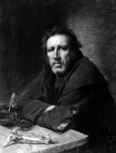
So what was possible? Confining ourselves for the moment to responses toward currents of ongoing poverty, rather than to treatments of discrete downturns, what was the cultural space available for picturing neediness? Here and there, it turns out, portraits might actually play a role. For occasionally, almost certainly working on speculation (rather than relying on prearranged commissions), early national artists—including the technically able and prominent among them—used portraiture to delimit scruffy and even overtly hard-pressed individuals. But it’s important to appreciate that these images generally do not stress their subjects’ deprivation so much as find ways to declare that even these figures might be reckoned sources of national inspiration. Hence Charles Willson Peale’s painting of the elderly (allegedly 134-year old!) Muslim former slave Yarrow Mamout accents the man’s face with warmth, seriousness, and dignity. And Samuel Waldo’s portrait of a beggar invests this figure with an expression of sufficient prideful strength to raise the possibility Old Pat was in truth (as the painting’s title asserts) admirably “independent” (fig. 1). By the same token, the period’s more accomplished streetscapes and more impressive initial forays into genre art give scattered mention to alms-seekers or to the contrast between well-to-do and needy folk. But the mentionings are so matter-of-fact or humorous that the sting of the depicted poverty largely drains away.
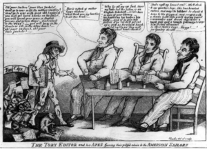
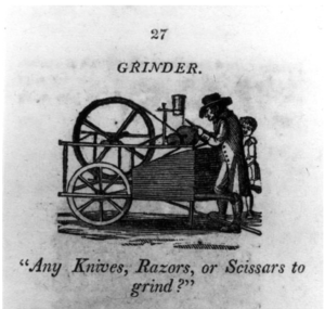
Other images—most of them prints but running from polished engravings to relatively crude woodcuts—strike a similar balance between acknowledging neediness and diluting its import. Magazine illustrations denoting the poor are prone to equip such personnel with comely faces and adequate costumes, while the derision contemporary cartoons sometimes direct toward paupers generally spring from these figures’ political positions rather than their economic standing (fig. 2). Even the American version of Old World Street Cries emerging in these years offsets the harshness of poverty. While acknowledging that the venders of goods and services who strolled the early national urban byways were sometimes “distressed,” the texts of these booklets describe such people for the most part as plucky “examples of application and industry.” And the illustrations garnishing their pages generally follow the same line, displaying criers in plain, perhaps unfashionable, but entirely presentable apparel (fig. 3).
In sum, the needy of the early Republic might be imaged—but for the most part only by underscoring something besides their difficulties or by softening what they had to endure. This, however, is not how matters remained. Even if we continue to limit ourselves for the present to engagements with ongoing destitution rather than with depressions and panics, it’s clear that antebellum pictures did indeed follow the overall growth of attention toward poverty and did indeed begin grappling with the hard-pressed more often and more thoroughly.
Admittedly, images of history and natural scenery (the latter now fully recognized as aesthetically top-flight) for the most part continued omitting mention of neediness. Indeed, high-end oil paintings as a whole remained generally closed to destitution. So too, portraits (both paintings and prints) registered no significantly enlarged interest in economically distressed figures, much less in harping on their lack of resources; and there were certainly cartoons that continued deploying paupers less to depict poverty than to score partisan political points. Moreover, as we’ll find, the images of poverty that did surface in antebellum years continued to evince significant constraints. Nonetheless, the years between 1820 and 1861 unquestionably featured thickening inventories of graphics (produced by artists who often as not worked in diverse forms of image-making) that proved increasingly alert to the nation’s poor.
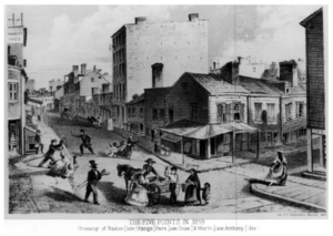
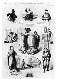
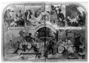
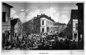
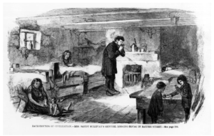
To start with there were now illustrations of the country’s maturing urban slums. City guides—surveys of urban centers published in these years—carried images of these districts (fig. 4). Equally notable, post-1820 iterations of City Cries occasionally involve illustrations conceding the hand-to-mouth condition of street sellers more baldly than previously typical of such graphics. Then too, Cries now segued into formulations of Street Figures: text-and-picture vignettes of individuals supposedly found on antebellum city avenues, fair numbers of whom are imaged as vividly ragged and presumably hard-pressed (fig. 5). Going further, graphics of poverty often accompanied the investigations, proliferating after 1820, into situations of poor folk (fig. 6). And there are likewise images mobilized to document the ever-sharpening contrast between “The Two Great Classes” of rich and needy Americans (fig. 7).
What accounts for this new openness to picturing poverty? One factor, ironically, was that the picturing was not more pronounced. The multiplication of images dealing with neediness was substantial. But part of why this increase could take place was that antebellum graphics in their entirety covered an astonishing spectrum of topics and issues. Accordingly, Americans did not feel overwhelmed by the uptick in imaged destitution. No less important, though, was that a good deal of this surge was propelled by a desire to explain. Living through what many believed were unprecedentedly rapid and comprehensive transformations, antebellum Americans were broadly desirous to learn about the alterations transpiring in their milieu. And inasmuch as lesser ranks generally, and poor sorts specifically, were conceived to be integral to the changing national environment, Americans found it more necessary—and legitimate—to ponder those below, including the hard-pressed.
Which in turn meant the ponderings themselves often carry explanatory intentions.Certainly this was true of the antebellum pictorial reactions to destitution. Take, for example, the images just cited. After all, whatever their other goals—alongside, say, their aim to amuse (as “Street Figures” sometimes do), and alongside rendering judgments (as in the outrage occasionally notched into imaged contrasts of rich and poor)—these graphics are manifestly about making neediness understandable. They strive to identify and situate its densest crystallizations (like Five Points) and locate it within the topography of America’s “Two Great Classes.” And they strive to demonstrate how poverty operated on public streets and amidst its own (“Genteel Lodging House”) domestic contexts. All told, they strive to make poverty not just more pictorially visible but also more legible.
It’s worth underscoring that large proportions of explanatory-inflected pictures of antebellum poverty, as again exemplified by the four prints just discussed, are set in cities. There were several reasons for this. First, post-1820 urban communities were deemed especially changeful and consequently especially suitable for imagery that sought to lay out understandings. Explanatory pictures of urban poverty in these years were to some degree thus simply part of the projects-in-explication evident in many city views. But equally trenchant was that poverty itself was deemed essentially urban. Persisting Jeffersonian notions of cities as toxically antithetical to the ideal of yeoman-based democracy may have been operating here, encouraging associations of destitution with built-up settlements (and of course preeminently with urban slums) rather than with fields and farms. And the coinciding inclination to celebrate rustic vistas (apparent in antebellum landscape art) surely also had an effect, if only by making it comparatively difficult to conceive (and especially to picture) needy folk in the hinterland. In fact, there wasrural poverty in post-1820 America. But with occasional exceptions (including occasional graphics of raggedly costumed non-slaves in notionally rustic American settings and scattered illustrations of neediness in foreign countrysides), it was rarely pictured. If explanatory images of urban destitution traded on general dispositions to essay understandings of cities, they probably drew as well on widespread leanings to equate American poverty primarily with the nation’s larger communities.
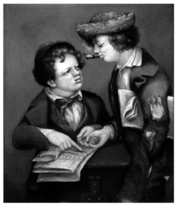
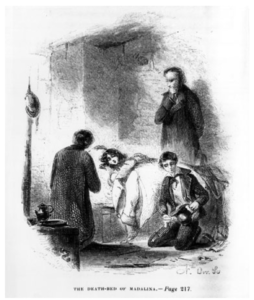
That said, there are also pictures touching on neediness in these years, even on urban neediness, that are accented somewhat differently from the images discussed to this point. For the fact is there are pictures that, while scarcely avoiding efforts to project understandings of poverty, advance a different brew of intentions: not just mixing explanation with other goals but giving these other goals major emphasis. For example there are images—including at least one oil painting—that focus on the emerging propensity of certain (usually upper-class) individuals to treat the city poor as objects of considerable (albeit aloof) curiosity: as interesting “sights” (fig. 8). At the same time, there are now images that fully embrace sympathy. Sentiment was by now in full flood in the United States. And although earlier worries about exciting untoward “feelings” by no means vanished, there was relatively greater tolerance for illustrations recording sympathetic involvement with the “wretchedness” of the destitute. In fact, images of sentimental charitable caring became one avenue by which earlier resistance to picturing poor whites-under-supervision was also put aside in these years (fig. 9). Alternatively (and possibly in direct reaction to such sympathy-drenched offerings), there are pictures harping on unappealing needy sorts. David Gilmour Blythe, an artist who (somewhat anomalously) depicted the poor in paint, was one picture-maker quite prepared to set forth low-ranked, and intermittently overtly needy, figures in ways that gave primacy not to providing explanations, or interesting “sights,” or subjects worthy of sentimental empathy, but to posit the off putting (fig. 10).
So all in all antebellum America hosted swelling inventories of pictures grappling in one way or another with the nation’s poor. And as this bundle of images gained traction in the culture, there arose what amounted to an iconography of poverty, a language of signs that helped make neediness recognizable in graphic representations. Most obviously, there was the emblem of tattered or patched clothing. Mobilized sporadically in early national years (in Old Pat and cartoons but not in all Street Cries), and admittedly used somewhat inconsistently thereafter (not for both Blythe’s figures, for example), ragged costumes nevertheless developed between 1820 and 1861 into relatively reliable pictorial indicators of material deprivation. Added to this was shoelessness or scanty footwear (visible, for instance, among some Street Figures). While barefoot figures might continue as markers of healthy simplicity in images of rural life, individuals lacking any or adequate footwear in city settings came to connote people in need. At the same time, picture-makers also began using disorder to flag poverty, with the disorder extending from physical to moral. In the 1859 rendering of Five Points noted above (fig. 4), for example, ramshackle structures (also apparent in fig. 6) coincide with a policeman gesturing inadequately as one woman falls (perhaps from drunkenness? perhaps from being assaulted?) and another lifts her skirt in the beckoning gesture of prostitutes. What’s more, images of city destitution sometimes signal disorder by noting racial mixings. A frequent feature of northern slums in these years, racial heterogeneity was part of why northern whites not living in these districts often judged them disturbing—not least when (as in fig. 4) blacks participating in the mix are shown as well-(even over-) dressed: blatantly stylish clothes here serving as their own counterpunctual designations of poverty’s disorder.
Yet even with all these aspects of this imagery acknowledged, there remains more to say about post-1820 pictures of needy Americans. Specifically, there remains more to say about how this imagery was bracketed: about how antebellum picturings of poor folk, for all their increased capaciousness, remained limited to certain tracks. Photography, for instance, was rarely brought to bear on the destitute in these years. The need of early photographers to have subjects that were largely motionless, and the consequent inclination to turn cameras on unpeopled outdoor scenes or on figures willing and able to pay to sit quietly for studio portraits, doubtless contributed to the paucity of photographs dealing with the hard-pressed. But it seems equally plausible that, unlike their counterparts in the late 1800s (many of whom were riveted by the poverty-revealing photographs by Jacob Riis), antebellum Americans were simply not ready to see, or purchase, camera-made images of Five Points residents in any great number. Hand-crafted graphics were one thing. But it would be a while—perhaps it would require exposure to photographs of Civil War battle scenes—before there was much call for directing the camera’s purported ultra-accuracy toward harsh economic conditions.
There were likewise constraints on pictures of southern poverty. There was, it’s true, a blossoming of antebellum graphics illustrating southern slaves, many of whom are presented in the tattered regalia of poverty. (Indeed, by locating these figures in hinterland locales the images constitute something of an exception to American unwillingness to giving neediness a rural address.) But in keeping with the general disinclination to construe slaves as poor, the purpose of these typically northern-composed images was more to explore the humanity of African-Americans, and in some instances raise questions about chattel servitude, than to dwell on the scanty resources of these figures. Since, moreover, the antebellum escalation of full-throated attacks on slavery often left southern whites markedly defensive about the effect of “the peculiar institution” on the region’s majority race, there was comparatively little eagerness among these individuals to embrace treatments, including graphic treatments, of a problem like poverty afflicting their own kind. This is not to say there were no pictures of needy whites in the Old South. But the indications are that whites below the Mason-Dixon Line were less receptive to such graphics than either they or northerners were to images of destitution in the North. And given this lack of receptivity, there was probably less space in the culture as a whole for images of poverty in Charleston or Richmond than for pictures of Five Points.
A final limiting attribute attaching to graphics of neediness in these years was their apparent apprehension about universalizing the needy: about making their condition altogether familiar and proximate. Because this apprehension commonly kept these images grooved within formulations that cast the poor, even the northern poor, as “other.” This was particularly obvious when, amidst their explanatory or other undertakings, the images imposed negative stereotypes on those in need. Inasmuch as the poor are now and again depicted as intemperate or otherwise enmeshed in disorder, or as black, or with the lantern jaws or pug noses used to sign the Irish—inasmuch as this is true, pictured needy folk become at once flawed and distinct. (In practice Blythe probably drew on such types in cobbling up his disagreeable faces). Not only do such pictures often allow these stereotypes to carry explanatory force (implying their protagonists are poor largely because they are drunk, black, or Irish), but they also define their subjects as qualitatively less than and different from the audience these same pictures willy-nilly conjure up. The images wielding such formulations, in other words, implicitly propose that among those looking upon these graphics were contingents of not-poor, sober, and presumably native-born and white respectable sorts who do their picture-perusing from positions of superior distinctiveness.
But the poor were separated off even without recourse to denigrating caricature. They were separated off because the bulk of pictures treating the poor in these years were generated from the outside. It’s not just that artists crafting the images were usually of at least middling standing. More fundamentally, it’s that pictures containing poor figures—even pictures the needy may themselves have looked upon—were not produced at the behest of the hard-pressed and did not embrace their point of view in any clear or reliable manner. To be sure, this was not unique to the needy or to antebellum decades. Pictures have frequently recruited people into their frames more or less unilaterally. And throughout American history images treating lower strata—not just the poor but working folk generally—have especially tended to be of (rather than by) these constituencies. Moreover (turning back to Old Pat), it’s apparent images fashioned from the outside have nonetheless managed to depict the needy with respectful seriousness. Nor should we fail to realize that both lesser folk as a whole and the poor specifically have in any case proved persistently capable of using the dynamics of visuality in America—the whole gamut of “seeing” and being “seen” in the culture—to assert themselves. Yet it’s equally evident antebellum picture-makers were often reluctant to construe poverty as a normal feature of the Republic. And alongside their increased references to needy sorts, post-1820 artists consequently often end up holding these individuals at arm’s length, crafting graphics that speak at, or about, or down to the destitute rather than for them. Even when bridged sympathetically, the apartness of the needy abides—is expressed as what requiresbridging—in images. So that antebellum pictures are indeed commonly limited to denoting the poor as “other.”
Thus some of the possibilities, and accompanying strictures, characterizing pictures between the Revolution and the Civil War as they reacted to the developing presence of needy folk in the Republic: to the reality of poverty in both good times and bad. But what of graphic responses to more episodic economic crimpings? What of the downturns that arose only periodically but, upon arising, imposed added pressures on the already hard-pressed and startlingly novel burdens on swathes of the better-off? How were these hard times pictured?
At first not extensively. Although his rags are attributed most immediately to his craven deference toward Britain, the material distress of the pauper posed in the early national cartoon mentioned previously (fig. 2) almost certainly connects to the trade dislocations surrounding the 1807 trade embargo. And the date of his portrait (fig. 1) makes it at least possible that Old Pat‘s poverty relates to the economic collapse of 1819. In the final analysis, however, and in line with the general hesitations to picture destitution in the Republic’s initial years, neither image grapples directly with the two downturns. And few other early national pictures allude to them at all.
But this mode of dealing with downturns soon changed. In keeping with the increased (albeit bounded) antebellum pictorial engagement with ongoing poverty, the major post-1820 collapses received increased graphic attention. In fact, the graphic coverage of these crises occasionally incorporates elements of the images referring to more rooted neediness. But pictures dealing with antebellum crashes also display their own characteristics.
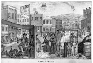
Consider, for example, pictorial responses to the unraveling of 1837. The graphics most prone to addressing this Panic were those most open to treating current events: “news.” Hence political cartoons took the lead. And among these was “The Times” by Edward Clay (fig. 11). The creator of a large and varied oeuvre of images (including several prints savagely mocking northern free blacks), Clay produced this stand-alone lithograph in the summer of 1837, just as the import of the downturn began to be felt. Configured as a panorama of densely packed scenes, several with a decidedly theatrical feel, the picture presents figures that often run to repulsive types. Not just the drunk (to the left), but also the callous landlord, the carriage-fitted lawyer to the right, and presumably the unseen proprietor of Shylock’s pawnshop (this last detail reflecting the antisemitism occasionally springing up in the milieu): all verge on disparaging caricatures. So that in this case it’s not just the unsavory poor but others as well who are “othered” by means of offputting stereotypings. But this does not stop Clay from simultaneously displaying the human cost of the downturn. If the drunk has only himself to blame, his stricken wife, the pathetic widow pleading with her landlord, the crowd storming the bank, the cartless teamster, and the unemployed (and barefoot!) workers in the foreground: these are all surely innocent casualties. In fact, another inflection of his stereotyping is that some of his needy figures—the widow and bedridden wife especially—amount to the kind of positive (and melodramatic) caricatures also loose in antebellum America, accompaniments to the extravagantly sentimental presentations of poor waifs (like the girl in fig. 9) circulating through the culture. Still, notwithstanding his reliance on types, Clay departs from received cartoonist practices and makes his downtrodden victims more than mere tokens of ideological postures. For are they not manifestly suffering? Indeed, the frantic crowd, the widow-landlord encounter, and the tradesmen’s jarring combination of unragged apparel and shoelessness together comprise the artist’s method of registering, not merely the condition of those already poor, but the new—and shockingly unanticipated—stringencies besetting all kinds of residents of communities like Boston, New York, and Philadelphia amidst the 1837 Panic.
And then Clay ties it all together with a political indictment. Although his attack does not overshadow the print’s recitation of hardship, Clay’s critique is hard-hitting. Positioning his scenes beneath an ironic July 4th banner and, more pointedly, a sunburst of Andrew Jackson’s signature hat, glasses, and pipe set beside the sinking balloon of the Democrats’ banking scheme, Clay joins other Whiggishly slanted cartoonists in blaming this crisis on speculative practices springing from Democratic fiscal policies. Triggered by identifiably wrongheaded decisions, the 1837 Panic is thus depicted as deeply unusual. And as a result, even as it includes the poor in variously permutated typologies, “The Times” ultimately manages to keep at a distance all its needy figures—whether they are pictured as malevolent or blameless—by continuing to construct their condition as fundamentally abnormal. But then too, no less significantly, Clay uses his partisan analysis to bolster the explanatory force of his image. Like other antebellum images bearing on economic difficulties, Clay’s cartoon rode the legitimizing crest of explanation. And for this image, the basic understanding turns on the mistaken political vision of Jacksonian Democrats.
So joining elements that were familiar with others that were novel, “The Times” takes its place as a picture that confronts the 1837 downturn in a strikingly direct manner. What’s just as striking, however, is that aside from a few other political cartoons, Clay’s decision to use his confrontation to harp on the sufferings caused by this collapse—to dwell on its destructiveness—seems not to have been widely replicated at the time or particularly prominent subsequently. In truth, it’s hard to avoid the sense that alongside the mounting post-1820 willingness to picture panics, (perhaps part of what made that willingness possible), were certain hesitations. More concretely, it’s hard to avoid the sense that there existed concern in these years that if graphics placed too much stress on the grim consequences of economic crises, pictures of such crises might, even more than images of ongoing poverty, provoke doubts about the ultimate soundness of the American political economy. Picturing downturns was one thing. But Clay may have marked the limit in illuminating the suffering they produced. Too many overly vivid illustrations of the social carnage wrought by a specific panic might themselves arouse panic.
The likelihood that such concern was indeed at work is bolstered by the pictorial reactions to the 1857 crash. On the one hand, this collapse was probably more fully imaged than any previous American economic crisis. On the other hand, the images responding to this Panic often seem to pull their punches. To begin with, political cartoons were rarely in evidence, which meant that the vehicle through which Clay unleashed his survey of distress was less available than twenty years earlier. One reason for the relative scarcity of political cartooning about this collapse may have been that it was less easy to assign precise partisan blame for what transpired in 1857 than for what had happened in 1837. Another factor, however, may have been that by the 1850s, political cartoonists were heavily preoccupied with sectional tensions and disputes over slavery, and in the context of those controversies hard-edged graphic commentaries about the new economic downturn might well have seemed too threatening. At any rate, what emerged in place of free-standing political cartoons were scattered paintings of mostly well dressed Wall Street crowds at key moments of the implosion. What emerged most of all, however, were prints in the periodical press. And what emerged, too, was that these prints were tilted in special ways. Newspapers and magazines ran articles covering the 1857 downturn from many angles, including accounts of forlorn job searches and suicides among desperate working folk. At the same time, the periodicals carrying pictures—mainly the era’s more amply resourced magazines (or journal-magazines)—now and again published pictures registering the steady beat of poverty during the years surrounding the crash. Notably, however, the images that the most picture-heavy periodicals fixed directly on this crisis tended to downplay its human cost.
We can see this in the issues of Harper’s Weekly that appeared toward the end of 1857. Launched earlier in the same year, Harper’s Weekly was among the most lavishly illustrated of contemporary magazines (providing assignments, as fig. 7 reveals, to promising young artists like Winslow Homer). It was also a publication that enjoyed a remarkably hefty circulation and devoted a remarkably large number of images to the Panic (its treatment of the downturn probably playing out as often in pictures as in written articles). So while its immediate readership may have drawn more heavily from middling and upper ranks than from lesser sorts (and while periodicals catering to laboring folk may occasionally have struck their own pictorial notes), Harper’s Weeklyhad sufficient resonance across the milieu, and gave sufficiently pronounced graphic attention to the collapse, that its graphics went far to shape America’s overall pictorial engagement with this bout of hard times.
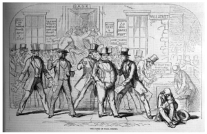
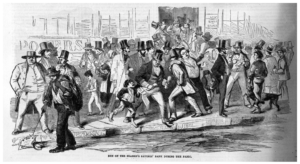
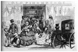
How, then, did it image the 1857 Panic? Now and again there are images reporting scenes outside failed banks (fig. 12 and fig. 13). Confined to male figures, these illustrations range from documenting irreverent naughtiness (the pickpocketing youth) and well-heeled figures displaying smug confidence, on the one hand, to noticings of despair (the older man seated on the curb), and of fiscal tumblings (the rag picker fetching up a newly worthless note), on the other. But these latter noticings are just elements of the narratives. And the images as a whole contain enough humor and variation to prevent them from becoming anything like declarations of unalloyed catastrophe. So too, scattered pictures of stores holding frantic sales (“epidemics” as they were called) take the same modulated tone by confining poor folk to the background or to mentionings of mischievous boys, while giving pride of foregrounded place to unattractive but manifestly un-suffering wealthier folk (fig. 14).
Such prints succeed in acknowledging yet also deflecting the painful impact of the crisis. But the magazine accomplished these same twinned goals even more effectively by making heavy use of images designed to be fully humorous. Almost from its inception Harper’s Weekly printed what amounted to non-political cartoons: images that relied on social types but not on partisan politics—cartoons of social manners. This brand of picture was of course neither new in the 1850’s nor confined to this magazine. And Harper’s Weekly itself marshaled cartoons of this kind to explore many subjects. Yet if (as suggested) its pictorial treatment of the 1857 Panic was influential in the nation’s aggregate graphic handling of the downturn, much of how Harper’s Weeklyeffected its ramifying treatment was through cartoons which perform the joint task of recognizing the crisis and offsetting fears.
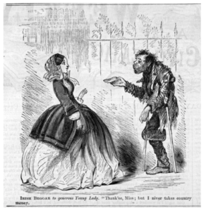
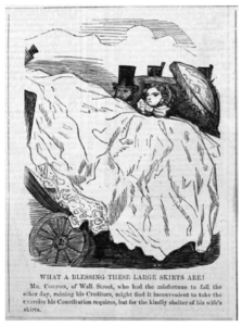
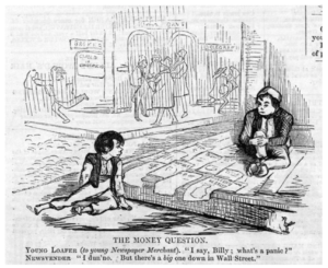
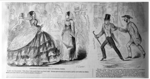
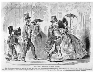
So, for example, the magazine’s cartoons soft-pedaled the heightened deprivations the crisis inflicted on those already poor. Now and again, trading on findings of some contemporary investigative journalists, this was done by illustrating the destitute faking their misery. Alternatively, the poor (signaled by ragged costumes and often sporting Irish physiognomy) are shown sufficientlyundesperate to turn down charity offered in doubtful currency (fig. 15). While on some level such merry tempering of neediness could undercut the separateness of the poor (and even the strangeness of poverty as a condition), the hard-pressed are still kept at a distance in these images by unattractive stereotyping, by contrasts to the non-poor, or by both together. And the larger truth in any case is that these cartoons concentrate as much on better sorts as on the destitute. In some instances the cartoons (coming as close as they allow themselves to personal accusations) present the better-off as businessmen enmeshed in distasteful or cowardly behavior (see fig. 16). More commonly, the goal is to demonstrate that, whatever financial reversals it caused, the Panic did not really harm the non-needy. At times this message is transmitted indirectly, by having “Wall Street” worries mouthed—and thus trivialized—by down-at-the heels (or barefoot) youths (fig. 17). Generally, though, notions of middle and upper ranks escaping largely unscathed are advanced quite overtly. So, for example, the Panic’s purportedly “Dreadful Effects” on these constituencies are shown to actually entail little more than going without crinoline or stylish facial hair (fig. 18).
But there is another dimension to these jocular visions of better-off Americans in 1857. In asserting that these people had little to complain about, the images frequently imply that such individuals believed they were facing grave sacrifices, and were foolish to hold that view. Once again (as in Clay’s cartoon), the negative stereotyping impulse carries beyond the lowly, with the Harper’s Weekly cartoons often fitting the non-poor into the tartly unflattering type of self-indulgent, whining, lovers-of-luxury entirely oblivious to how their situation compared to the really unfortunate.
More than that, these figures are ignorant of how, as a type, they have contributed to the downturn. For in their depictions of better-off Americans these cartoons effectively corroborate an analysis of the 1857 Panic widely heard at the time: that over and above this or that nefarious merchant and banker, the root cause of the crisis was a mounting embrace of luxury sadly at odds with the nation’s founding republican devotion to simplicity. Hungering for extravagance (so ran this view) Americans were living beyond their means, “trusting to some bold stroke…or lucky adventure to supply the deficiency,” all of which encouraged ruinous speculation. Although not an unprecedented perspective on economic downturns, this line of interpretation was unquestionably emphasized in 1857. And it clearly echoed through theHarper’s Weekly cartoons, providing them with an explanatory prism comparable to Clay’s more precisely partisan interpretation. As writers advancing this view often implied, moreover, and as the Harper’s Weeklycartoons commonly suggest, a key expression of this fall from ascetic grace was a hankering for fashionable appearance, perhaps particularly (drawing on republicanism’s long-standing doubts about female self-discipline) the hankering of women for fine clothing. Just as important, however, many observers, again manifestly including the cartoonists published in Harper’s Weekly, believed it was members of “the higher classes of society,” men and women alike, who were most culpable. For (it was intimated) these were the people especially prone to the “melting down” of “honor and principles” that was corrupting the commonweal.
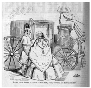
Hence the barbed cartoons of better sorts. Yet there are further twists to these images. The luxury-loving swells they chastise are of the same broad socio-economic standing as many readers of Harper’s Weekly. So that for all intents and purposes these prints deploy negative representations, and indeed (ringing yet further changes on stereotypes) negative caricatures, that are not distancing, or at least not only distancing. Up to a point, the silly fops and belles in the cartoons are joined with portions of the magazine’s assumed audience in collaborative guilt. Indeed, the cartoons unleash what may be characterized as a kind of collective consumerist jeremiad. We have done wrong, these pictures say, and brought this disaster upon ourselves. What’s more, the solution is as obvious as our trespasses. We must return to virtuous simplicity. So we will don last year’s fashions and pawn our finery (fig. 19 and fig. 20).
But then come more twists. First, it’s all a joke. The down-dressers are more silly than reformed and the lady does her pawning from a carriage, all suggesting the charge of immorality is issued tongue in cheek and the changes called for may well be less than profound. Second, perhaps in the end there is a kind of distancing. Even leaving aside that Harper’s Weekly likely attracted at least some plebeian followers, the better sorts viewing the magazine’s funny pictures were exposed to differentiations among themselves. For surely tucked into these cartoons is the quiet thought that you and I, the right-thinking better sorts reading Harper’s Weekly, can go on largely unchanged because we are more like the plain lady in figure 18 than the mincing fools of these pictures. We are proper; they are reprehensibly different. Indeed they are so different that even as these pictures attribute the collapse less to discrete policies than to moral declension (and even as the cartoons, in some degree, diminish the separateness of poor folk and of poverty), the images still delimit the Panic itself as an anomaly: the appalling consequence of particularly appalling individuals. And in doing this much, of course, the cartoons also, implicitly or explicitly, enclose distancing distinctions that allow decent better sorts to condemn excess and still remain blameless.
Such was the broadly reverberating imagery Harper’s Weekly directed toward the 1857 collapse: a cluster of graphic offerings that modulated rather than punctuated misery; that traded on humor as much as on ghastly revelations; that depicted the non-poor as frequently as the needy; and that found ways at once to scold better sorts, chuckle about the scoldings, and finally let these individuals quite completely off the hook. It was, all told, a fitting dénouement to how want was pictured in the Republic between the Revolution and the Civil War. For it demonstrated that alongside the cumulatively greater imagery of American poverty and downturns there was another continuing story of pictures approaching these topics through particular inflections and perspectives, and indeed through hesitancies and constraints that diminished but never disappeared. Against this background was it not appropriate that Harper’s Weekly illustrated the collapse of 1857 in ways that noticed what was happening—but also looked away?
As we have suggested, the graphic record stretching across these decades was by no means homogeneous. And it is doubtless true the non-pictorial engagements with material want in early national and antebellum America enclosed their own inflections and limitations. Yet the burgeoning role of images in the culture, combined with the way images approached destitution and downturns, ensured that from early on the manner in which the Republic met economic bad news was flavored by ambivalence. It was flavored, that is, by tendencies to find poverty and sudden collapses increasingly difficult to ignore and yet continuously important to muffle in one way or another. The pattern hardly stopped with the Civil War. A further version is evident in the complex responses—from celebrations of high society to detailings of despair—kicked up by the Great Depression of the 1930s. But the particular ambivalence toward want apparent in the nation’s pictorial record between the 1776 and 1861 was clearly an important expression of what the Republic of these years did and did not choose to face: even, we might say, an important expression of what itwas.
Further reading
Since this essay deals with pictorial silences as well as with affirmative representations, the following titles often touch only obliquely on the subject of “images of want.” But they can provide points of departure for those interested.
Tyler Anbinder, Five Points: The 19th Century New York City Neighborhood That Invented Tap Dance, Stole Elections, and Became the World’s Most Notorious Slum (New York, 2001); Paul Boyer, Urban Masses and Moral Order in America, 1820-1920 (Cambridge, 1978); Joshua Brown, Beyond the Lines: Pictorial Reporting, Everyday Life, and the Crisis of Gilded Age America (Berkeley, 2002); Elna C. Green, This Business of Relief: Confronting Poverty in a Southern City, 1740-1940 (Athens, 2003); Stephen Hess and Milton Kaplan, The Ungentlemanly Art: A History of American Political Cartoons (New York, 1968); John A. Kouwenhoven, Columbia Historical Portrait of New York: An Essay in Graphic History in Honor of the Tricentennial of New York City and the Bicentennial of Columbia University (New York, 1953); Bernard F. Reilly, Jr., American Political Prints, 1766-1876: A Catalog of the Collections in the Library of Congress (Boston, 1991).
The author would like to thank Michael Zakim for helpful editorial suggestions on an earlier draft of this essay. Thanks are also due to Kelly Erby and Jacob Schulman for research assistance, and to Sarita Alami and John Klingler for help in digitizing the images.
This article originally appeared in issue 10.3 (April, 2010).
Jonathan Prude teaches history and American Studies at Emory University. His current project is “The Appearance of Class: The Visual Presence of American Working People From the Revolution to World War I.”
