Before 1822: Anti-Black Attacks on Charleston Methodist Churches from 1786 to Denmark Vesey’s Execution
Following the June 17, 2015, murders of nine worshipers in the Emanuel African Methodist Episcopal Church in Charleston, South Carolina, many commentators pinpointed 1822 as the most significant year in the history of violence directed against Charleston black churchgoers and their institutions. In 1822, Denmark Vesey was hanged after a guilty verdict in court and an independent black meeting house was razed by a mob of Charleston whites. Less understood, however, is a generation of vicious attacks before 1822 on Charleston black Methodists and the churches they attended. The destruction of the African Church in 1822 culminated a series of events that was in full force in Charleston no later than 1786. Almost from the end of the War of Independence, black Methodists in Charleston were subject to harassment. Instead of describing the destruction of the black meeting house as part of anger and paranoia revolving around Vesey and his accused co-conspirators, we should see a collision between two strands of violence. One strand was the decades of abuse directed at Charleston black Methodists who worshiped in mixed-race congregations in which they were the majority; the other strand was a precipitate response to rumors of an imminent slave insurrection.
In this essay, I analyze the decades of abuse and violence prior to 1822. Nineteenth-century commentators disturbed by the mistreatment understood it as a response to the large number of Charleston black Methodists as well as to the enthusiastic worship practices of those churches. This understanding was correct but inadequate on two counts. First, it never took a true measure of the significance of the number of Charleston black Methodists. They constituted the greatest number and the densest concentration of black Protestants in the world around 1820. No other center of black Protestantism—for example, Boston, New York, Philadelphia, St. John’s (Antigua), Kingston (Jamaica)—came even close to Charleston for numbers of black worshipers. Second, it gave black worshipers little credit for enthusiasm, conversions, and revivals among whites as well as among blacks. Yet the commentary of white contemporaries suggested that African Americans were at the forefront of enthusiasm. We gain a better comprehension not only of this history of violence but also of Charleston black Methodists’ self-understanding if we gauge the significance of their numbers and if we understand them as principal actors in the Methodist Episcopal Church and, later, in an independent congregation.
From the moment of the first Methodist presence in Charleston, black worshipers were present. In 1736, John and Charles Wesley visited the town, where they held services in the Protestant Episcopal Church. The minister at this church was Alexander Garden, namesake of the gardenia and, later, scourge of Methodist revivalist George Whitefield. The black worshipers at the service made an impression on John Wesley with their numbers and their piety. Curious about the black members, he tried to explore their faith. He recorded a telling conversation with a black woman in which he informed her that the body and the soul were discontinuous. She disagreed. In Wesley’s words, “I asked her if she knew what a soul was. She answered, ‘No.’ I said, ‘Do you not know there is something in you different from your body?—something you cannot see or feel?’ She replied, ‘I never heard so much before.’” Wesley reported on the conversation but seems not to have comprehended it. He perceived only a need for religious tutelage of black congregants, but in retrospect we see this exchange as a prophecy of the enthusiastic worship that would characterize Charleston Methodist congregations. The black woman (whom Wesley never named) had brought body and soul together in piety in a way that the Methodist theologian seems not to have been able to countenance. Worshipers, black and white, came to express the integration of body and soul, not their distinction, as black worshipers became, within two years of the founding of the first church, a majority among Charleston Methodists. In these congregations, black worshipers came to be, in effect, evangelists and revivalists, no matter who occupied the pulpit.
Religious enthusiasm was, of course, a feature of revivalistic religion, black or white. Yet white Methodists rarely credited blacks with fostering spirited worship and religious conversions.
The Wesleys’ 1736 visit also established two continuing themes in Charleston Methodism as, first, black Christians responded to white preachers who took risks in their efforts to spread the Word, and, second, itinerants ignited fires of religious zeal that spread through England, mainland North America, and the West Indies, encompassing blacks and whites equally. For example, the Wesleys were caught in a dangerous storm in St. Helena’s Sound on the voyage to spread the word into the South Carolina Lowcountry. Such risks would be undertaken later by George Whitefield and other Methodist itinerants, and the memories of the dangers inherent to ministry would become part of the collective memory of Charleston Methodists. Such willingness to face danger in the Lord’s service struck the hearts of black men and black women. And although white Methodists rarely recognized all the egalitarian and antislavery implications inherent in their church practices, black Methodists did not miss the message. Charleston Methodist churches of the late eighteenth and early nineteenth centuries provided one of the clearest examples of equality dawning in congregations in which both blacks and whites contributed to revivals.
The Wesleys were soon followed, in 1739, by the greatest Methodist evangelist of the eighteenth century, George Whitefield. Like other Methodist itinerants, Whitefield preached in the open air or in dissenting churches when he was unwelcome in the pulpits of the established church. In 1740, during an evangelical tour in Charleston, Whitefield was challenged by Alexander Garden for “field-preaching” and extemporaneous prayer. Although Whitefield was suspended by a colonial ecclesiastical court from preaching in any Protestant Episcopal Church, such spiritistic practices were embraced among black worshipers, drawing the racist ire of some of white Charleston who were suspicious of such enthusiasm. After his suspension, Whitefield simply sought alternative venues in the Charleston Independent (i.e., Congregational) Church and among the Huguenot congregation. Both these were Calvinist in theology (Whitefield and the Wesleys had not yet separated because of theological differences).
Braving storms, Whitefield returned to Charleston several times. During one of Whitefield’s stays, in the 1760s, John Marrant, one of the most famous early African American Methodists, was converted during a revival meeting in which Whitefield was exhorting. Like the appreciation of the daring of itinerants and the egalitarian implications of mixed-race congregations, revival meetings would later figure in a vast increase in the number of Charleston black Methodists. In 1775, even before a Methodist church existed in Charleston, white Methodists were, as Philip D. Morgan notes, “reprimanded for sponsoring black preachers who proclaimed radical messages.”
The success of the Methodists in gaining black as well as white adherents in places like Charleston is well explained by John Walsh. “It was the crucial determination of Wesley and Whitefield to launch into itinerancy, making the world their parish and not the parish their world, that turned Methodism from a small awakening to a full-scale revival,” Walsh writes. “The spread of early Methodism depended on its ability to integrate diverse constituent groups into the associational network of its societies. . . . Methodism was as much a missionary movement as a revival.” One of the greatest American missionaries was Francis Asbury, who was born in England in 1745 and migrated to the North American colonies in 1771. Beginning in 1780, Asbury took a special interest in black Christians and traveled with “Black Harry” Hosier, who drove their carriage, preached with Asbury, and, perhaps, shared interpretations of Scripture with the white itinerant. Soon Asbury turned his attention to Charleston.
In 1785, Asbury arrived in the city, procuring, with the help of a local white sympathizer, an abandoned Baptist meeting house between Water and Tradd Streets. The Methodist Episcopal Church had just separated from the Episcopal Church in December 1784, and Asbury had just been ordained and named superintendent (later, over the objections of English Methodists, bishop). The Baptist congregation scattered by the War of Independence, the building became Charleston’s first Methodist meeting house. In Charleston, the Arminian Asbury felt beset by Calvinist Independents, Huguenots, and Scots Presbyterians on the one side and the wicked population of the major slave-trading port of North America on the other. In a series of visits to Charleston, Asbury realized that black churchgoers were a mainstay of his support. In December 1785, the Charleston Methodist Church reported thirty-five white and twenty-three black members—the only year in its first half century of existence in which white members were a majority.
The year 1786, in which blacks became a majority, saw the first attack on the church. The “success” of the Methodists—their increase in numbers, which was almost all due to new black members—led to vandalism. In the words of their nineteenth-century historian, Francis Asbury Mood, “When the congregation assembled one Sabbath morning, they found the benches helter-skelter in the street, and the doors and windows barred against them. This was taken as a hint that they were desired to change their quarters.” They found a new place of worship in a private home.
Nineteenth-century white Methodists like Mood understood that those who attacked their churches were angered by both spiritistic worship and the presence of black worshipers. Religious enthusiasm was, of course, a feature of revivalistic religion, black or white. Yet white Methodists rarely credited blacks with fostering spirited worship and religious conversions. Today we need to emphasize that the spiritism of black worshipers—including the experience of the black woman who refused to disjoin body and soul—helped form the very environment in which conversions occurred. Our challenge as scholars is that white authors almost never named black converts or assumed that their experiences should be inscribed in print. Today scholars recognize that black worshipers were a crucial part of the context in which white conversions took place. Conversions during church services or revival meetings were communal rites. An enthusiastic preacher, an emotional crowd with its own cries, songs, and movements, and some members gripped by their own mix of Christian beliefs and deeply felt regrets over past sins added up to emotional conversions. Records of Methodist Charleston include a terrible paradox: black members created the matrix in which conversions occurred and of course they converted themselves, yet when the chroniclers of the churches named converts, they chose white ones, not black.
White Charlestonian George Airs was, for example, identified when not one black member of his black-majority church was named. Yet his conversion occurred in the context of a congregation in which white men were a minority. “We may mention the conversion of George Airs,” Mood wrote:
He was a man of impulsive, ardent temperament, and had been long confirmed in sinful habits. He was seeking religion for some days under poignant grief for his sins. Light at length broke in upon his darkness, his captive soul was freed, and, as we might expect, the demonstration he made was not a little boisterous. After strongly assuring all present of the wondrous change which had passed upon him, he rushed from the building, anxious to tell the world what a merciful Saviour he had found. He ran towards East Bay, ‘Hallelujah!’ bursting from his strong lungs at every step. This produced a great sensation in the neighborhood, and quite a crowd took after the supposed maniac, who had been rendered so at the Methodist meeting. And ranging around several squares, much to the horror of the people living thereabout, what was their surprise to see him quietly return to the house, the big tears streaming down his face! Instead of finding a maniac, they had in truth fallen upon one who had been just clothed and put in his right mind, as his subsequent life of piety abundantly proved.
It is likely—though never stated—that one trigger of the attacks on the churches was black members prompting such dramatic conversions of white members. Sadly, the rich detail concerning a white convert contrasted with parsimony of words when a black Methodist became the subject. Mood everywhere recorded the presence and the spirit of black worshipers, but nowhere gave them credit for conversions. Yet it seems unlikely that the attackers of the church missed the role black worshipers played in conversions among the church membership at large.

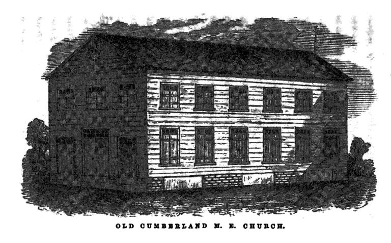
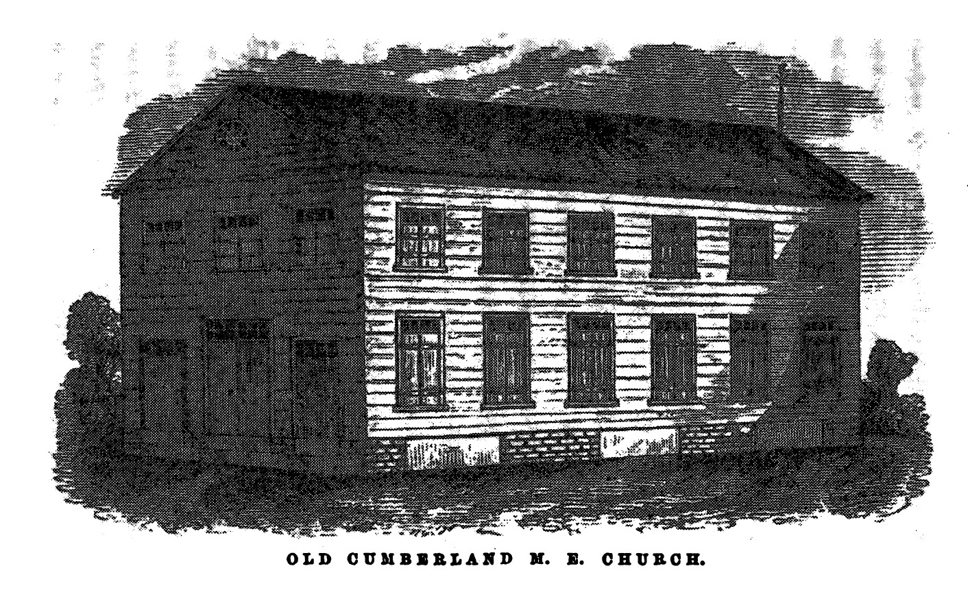
There were other slights of blacks in print—an absence in presence based on an assumption that white worshipers would be dignified with names but black ones would not. When the Charleston Methodists finally built their own meeting house, which came to be known as the Cumberland Methodist Episcopal Church, it required not only “galleries for the accommodation of the colored people” but also, of course, labor and materials for construction. The white men who provided materials were named, along with the prices paid them, in the 1856 history of the church. The lowest price was 1 pound, once for nails and once for stones, the highest 10 pounds, for labor, possibly that of slaves owned by the member. In any case, there were clearly unnamed laborers. For instance, some men were paid 5 shillings for carrying boards, while 10 shillings 6 pence was expended for “corn for workmen” (in a time when corn mush was a common food for Southern slaves). Emma Hart has noted the presence of enslaved workers in the building trades: “Up to 1800, Charleston building artisans owned at least 250 slave carpenters, bricklayers, painters, and plasterers.” Similarly, once the building was open for services, its “floor was always covered with a layer of clean white sand.” Who hauled the boards? Who spread the sand? No word was recorded about the race of the lowest-paid laborers, yet the pattern of the attestations suggests that white men would be named while black men would not be. It seems likely that heavy or relatively poorly compensated labor was performed by black men.
By 1787, the Charleston Methodist Church had thirty-five white and fifty-three black members. February 1788 saw an attack on worshipers themselves (as opposed to their place of worship). A crowded church was “greeted with the first open demonstration of hostility from the inhabitants. There was a riot raised at the door. A general panic seized the audience. . . . At night, while the Bishop [Asbury] was preaching, the house again crowded to overflowing, it was assailed on all sides with stones and brickbats.” Asbury stood his ground as the mixed-race congregation was besieged. He recalled his sermon on Isaiah 52:7 as one of the most inspired of his long career. “I have had,” he reported, “more liberty to speak in Charleston than ever before, and I am of the opinion that God will work here.”
In 1789, the presence of Thomas Coke stirred another riot. A great apostle of Wesleyanism, Coke had evangelized in the West Indies, criticized enslavement, and helped establish in St. John’s, Antigua, one of the world’s great centers of black Protestantism. It was under his guidance that two memoirists of black or colored Antigua—Anne Hart and Elizabeth Hart—were converted. Although hardly antislavery, Mood’s 1856 history, in touching upon Coke’s visit, condemned “the illegal and cowardly assaults made by the ‘young chivalry’ of Charleston upon unoffending women and children while worshipping their God.”
Again in 1790, during a conference in which Methodist ministers and leaders proposed “Sunday-schools for poor children, black and white,” there were disruptions and insults directed at Charleston Methodists. The schools never opened. By 1792, the Charleston Methodist Church enrolled sixty-six white and 119 black members. By this time, slurs directed against the Charleston Methodists included that they fostered “negro-churches” and listened to “negro preachers.” Yet its members were grateful for their “season of revival” without acknowledging that the emotional and theological life of the congregation was conditioned by the mix of races within it. At the end of 1793, after a year of revivals, the congregation comprised sixty-five white and 280 black members.
In 1795, again the meeting house was attacked as “a crowd assailed the church, beating open the doors, and breaking down the windows.” Returning to Charleston, Asbury held prayer meetings for black worshipers. In 1797, the congregation “was still called to suffer much annoyance from rioters and mobs.” A grand jury of the Charleston district declined to recommend charges against the malefactors. Thus, “every night the services were interrupted by riotous proceedings outside; and the congregation, while in-doors, and especially when dispersing, were grossly insulted, because their cowardly assailants felt they could do it with impunity.”
Also in 1797, the congregation began construction of a second building, Bethel Methodist Episcopal Church, possibly to counter schismatic members who had seceded to form a Primitive Methodist Church. With a less central location, the Bethel meeting house proved attractive to black members seeking to avoid white mobs. This was a time of a “large increase of colored members.” Mob violence occurred again in 1800, worsening when it became known that a Methodist minister assigned to Charleston for the year had received a packet of seemingly antislavery writings from the North. A crowd of “patriotic bullies” mobbed the minister as he left church and sought to “dunk” him under a nearby water pump. After he escaped, the mob grabbed another Methodist and dunked him to near-drowning.
Asbury preached in the Bethel Church in 1798, reporting that in the parsonage he received “visitors, ministers, and people, white, and black, and yellow. It was a paradise to me and some others.” Again the nineteenth-century historian omitted the name of a significant black man. Asbury had arrived to find the parsonage building completed but unfurnished. He “gravely sat down on the door-step, no one knowing of his arrival. A negro man passing observed him sitting there, and recognizing him to be the Bishop, stopped, and told him no one lived there. ‘I know that,’ said the Bishop. ‘Where do you want to go, sir? I will show you the way.’ ‘I want to go nowhere,’ said the Bishop: ‘I will spend the night here.’” After this exchange, the black man informed some other church members of Asbury’s arrival and intentions. They pressed upon him to go with them instead of staying on the street. When he refused, they carried furnishings to the parsonage to make him comfortable. Once again, the language could suggest black church members. It is certain, in any event, that black believers populated Asbury’s “paradise.” “He was able there, untrammelled by forms or customs, to manage things his own way, and, as far as possible, make a paradise below, by constant communion with his God.” He convened “family worship,” attended “by a number of colored persons . . . so that often at family prayer at the parsonage, there would be an assembly of forty or fifty persons.”
Another glimpse of the type of white minister appeared in commentary on one of Asbury’s itinerant colleagues who died in 1803, possibly of yellow fever. Bennet Kendrick “was a close student, and a skilful eloquent preacher; and, with it all, perhaps his highest eulogy is, ‘The poor Africans repeated his name and death with tears. He was a willing servant to slaves for the sake of Christ.’”
No one could better evoke the link between violence and church demographics than Mood. From 1794 to 1804, “there was a decrease of three white members; and, as it includes the period of the most violent open hostility to the church, this should go far toward convincing those who think that persecution is the time most favorable for the growth of the Church, that they may be mistaken. The colored membership, however, continued to increase with a steady growth. They averaged, during this decade, a yearly increase of sixty-two; so that at the close of the year 1804, they numbered nine hundred and three.”
Disruptions of religious services occurred again in 1804 and 1807. Black worshipers gravitated toward the Bethel Church since its location seemed to attract less attention from the mobs. “The blacks had become so subject to annoyance at Cumberland, that they preferred to attend Bethel, which thus so far had not seemed to attract much attention from the rioters. The church, as was always the case on Sabbath afternoon, was crowded with blacks.” That day the captain of the city guard marched up the aisle and ordered the mixed-race congregation to disperse. Black churchgoers “emerged into the street and graveyard only to find themselves captured. Then, in a hollow square, as felons or incendiaries, they were deposited en masse in what was then known popularly as the ‘Sugar House.’ Singular to state, no reason was ever assigned for this outrage, nor any explanation given for this extraordinary procedure.” An 1838 narrative by a runaway South Carolina slave described this house of correction: “I have heard a great deal said about hell, and wicked places, but I don’t think there is any worse hell than that sugar house. It’s as bad a place as can be.”
Revivals surged through the congregations in 1807 and 1808. In 1811, a “powerful religious influence rested upon the congregations during the year, and at its close an increase was reported of eighty-one whites and four hundred and fifteen colored members.” Church membership swelled, with black membership increasing at a rate five times that of the white membership. By this time, there were established classes led by black laypersons for prayer and religious conversation among black believers. The classes were an important institution insofar as they kept believers close to Methodist beliefs and they allowed some black church members leadership roles as class leaders. At “the Conference of 1815, a membership was reported of two hundred and eight-two whites, and three thousand seven hundred and ninety-three colored.”
However, the stage was being set for an exodus of black members. First, in 1815, the white minister then in charge, Anthony Senter, initiated an investigation into the use of funds collected from black Methodists, which had remained with black class leaders. The inquiry revealed what appeared to at least some white Methodists to be “much corruption.” A modern account mentions that some donations were used to purchase the freedom of slaves who were to be sold away, but there was no indication in the primary documentation that Methodist preachers objected to that as corrupt. Donations from black churchgoers were ordered to be transmitted to the stewards of the Methodist Episcopal Church, no longer retained by black class leaders. Second, white members announced that part of the church’s black burial ground was to hold a storage building for hearses. Third, a rapid increase in black members led to a total of 5,690 by 1818. The black worshipers almost certainly felt that they had enough strength in numbers to form their own congregation. The question inherited by early twenty-first-century scholars of American religion is what the worshipers thought their congregation might be. Most scholars have assumed that the goal was an African Methodist Episcopal church, but the evidence from Charleston suggests that it was more likely to have been an independent Methodist church.
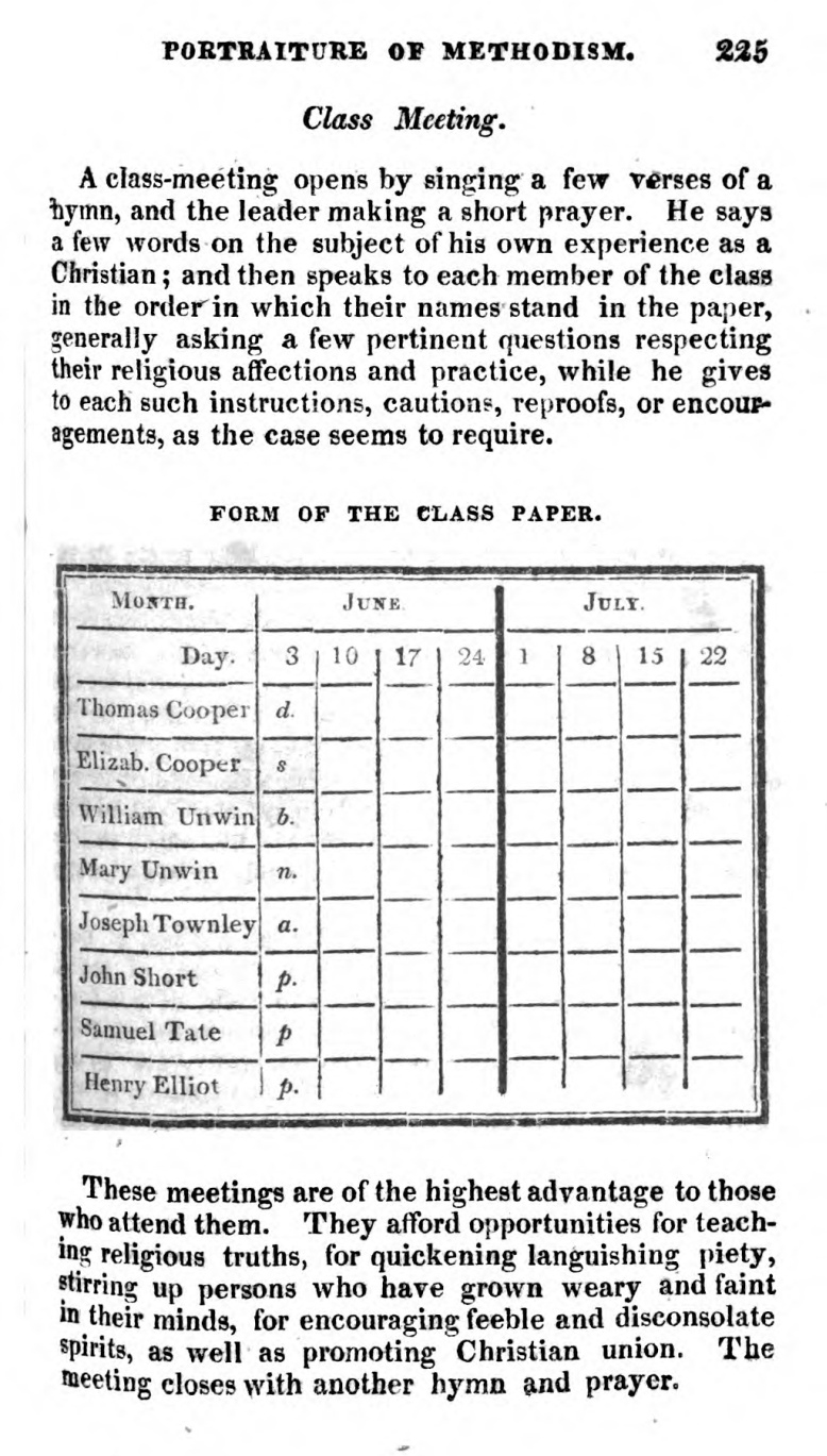
Two Charleston black Methodists, Morris Brown and Henry Drayton, traveled to Philadelphia in 1816 and then again in 1818. Brown had been attending the Charleston Methodist Bethel meeting house. In Philadelphia, in May 1818, Brown was ordained an elder and Drayton was elected a deacon. In 1817, a Methodist minister, Solomon Bryan, wrote to the Charleston city council with his concerns about black worshipers forming their own congregation. Then, in Charleston, in 1818, “at one fell swoop nearly every leader delivered up his class-papers, and four thousand three hundred and sixty-seven members withdrew.” Class papers were documents maintained by class leaders for recording the activities of church members as well as keeping track of those who were trial members of the congregation. Black class leaders in other locations, such as Antigua, similarly maintained their own class papers. Since the class leader not only kept the documents but also inquired into the religious experience of his class members, possession of the papers indicated a leadership role. Yet class papers also served as a record of the attendance of members at prayer meetings. For instance, class leaders marked each person as “p” (present), “d” (distant), “s” (sick), “n” (neglectful), “b” (away on legitimate business), or “a” (absent), records that might well have been used against black people in Charleston’s racist, slave-holding environment. In surrendering their papers, the class leaders of black Charleston were removing themselves from white authority.
Although 1,323 black churchgoers remained within their traditional church home, the white Methodists were stunned by the loss of almost eighty percent of their black brothers and black sisters. Mood confirmed that piety had been corporeally felt during Charleston Methodist Episcopal services. “None but those who are accustomed to attend the churches in Charleston, with their crowded galleries, can well appreciate the effect of such an immense withdrawal. The galleries, hitherto crowded, were almost completely deserted, and it was a vacancy that could be felt. The absence of their responses and hearty songs was really felt to be a loss to those so long accustomed to hear them.” These lines were the closest Mood ever came to acknowledging the value of Charleston black Methodists in any way other than their numbers or their assistance to Asbury.
The 4,367 who left united into an African Church, according to Mood. Modern scholars have often called this an “African Methodist Episcopal Church,” but it was not clearly described that way at its inception, notwithstanding Brown’s and Drayton’s attendance at A.M.E. conferences. The evidence from around 1820 more likely suggested that its members viewed it as an independent black Methodist church. The African Church possibly envisioned itself as an independent Methodist congregation unaffiliated with a regional conference. Indeed a petition to the Charleston city council of January 27, 1817, for permission to purchase a plot for a cemetery was submitted by a black “Independent Religious Congregation,” while an 1818 petition to the House of Representatives described the petitioners simply as “Methodists, in the City of Charleston.” An 1830 letter by a white observer, James Osgood Andrew, insisted that the majority of the breakaway black believers desired to remain Methodists albeit in a church with both black congregants and a black minister. In Andrew’s estimation, Brown initially hid his plan for an A.M.E. church from his followers.
There had been previous breakaway independent Methodist congregations in Charleston, such as the Primitive Methodists, so there were local models in place for the black congregants. In effect these were models of congregations with revivalistic devotion (possibly planned to be missionary devotion at some future date), theology culled from Methodists with whom Americans were familiar (Whitefield, the Wesleys, Coke, Asbury), and freedom from a superordinating conference that would have enforced discipline, provided itinerants or missionaries, collected its share of church donations, and possibly owned church buildings or grounds. It is at least as likely that the breakaway black Methodists followed local models as that they affiliated themselves to the A.M.E. Church. Indeed, another schism, involving breakaway white Methodists, occurred in 1834, when a Methodist Protestant Church was formed in Charleston by whites who objected to blacks sitting outside the galleries in the Bethel Church. In short, there was a history of independent Methodist congregations in Charleston before and after 1822.
It is also possible that between 1815 and 1822, Charleston black Methodists envisioned becoming the apex of black Protestantism. That would have implied a congregation independent of outside entities other than God. An 1820 petition to the South Carolina legislature, subscribed by twenty-six black Methodists (including Brown and Drayton) and by thirty-four whites, described the black church as “the African Episcopal Church, in Charleston, called Zion.” Only a later insertion in the petition—the only revision in the document—added a superscript word, “Methodist.” The clerk who received the petition and initiated an account of its procedural history never described the black subscribers as African Methodist Episcopal. His terminology was “certain free persons of color . . . praying to be permitted to worship in a building created by them in the suburbs of Charleston.” The petition was denied.

Had the breakaway black Methodists united into an A.M.E. congregation in Charleston around 1820, they would have instantly established the demographic center of the A.M.E. Church as Charleston, not Philadelphia. Based on membership figures given at the 1822 A.M.E. conference, if those who had hived off from the Charleston Methodist Episcopal Church had formed an A.M.E. congregation, they would have outnumbered Philadelphia A.M.E. congregants by thirty percent and they would have comprised forty-five percent of all A.M.E. members in North America. Even at the time of Richard Allen’s death in 1831, the reported membership of the A.M.E. denomination was about 10,000. It is impossible to know what would have happened had Charleston’s breakaway black Methodists joined the A.M.E. Church, but the figures suggest that they would have been between thirty and forty-five percent of the entire denomination. Furthermore, the word “Episcopal” in the name of the church could have implied a black bishop in Charleston—highly unlikely in the structure of the A.M.E. Church around 1820. Today the church historian might wonder how a black bishopric would sit in an ecclesiastical hierarchy, but it is possible that a black bishop implied independence and leadership in Charleston around 1820.
Connections between the Charleston African Church and the Philadelphia A.M.E. Conference were not strong around 1820. The only use of the phrase “African Methodist Episcopal” to describe the congregation derived from the emendation in the group’s petition. The reputable white ministers who signed the ex parte petition were local Congregationalists or Presbyterians, who were closer to the Calvinism of George Whitefield than to the Arminianism of the A.M.E. Church. Indeed, the presence of those white subscribers suggests that Charleston black Methodists were returning to their roots in Whitefield. Once again, Mood perceived an essential truth about Charleston Methodism. Despite the conflict with Wesley over free grace and predestination, Whitefield earned Mood’s praise because “it was, no doubt, of advantage to the future establishment of Methodism, that ‘justification by faith’ was fearlessly and powerfully proclaimed in Charleston.” Charleston black Methodists’ theological self-understanding around 1820 could have been Calvinist, not Arminian.
One tie between the Charleston black Methodists and the A.M.E. Church was the ordination of the two Charleston black men in Philadelphia. Moreover, Brown traveled to the 1819 and 1822 annual conferences. Richard Allen was qualified as a bishop to ordain other men—as he had been ordained by Asbury—but their ordination neither made them members of the A.M.E. Church nor created a congregation of the A.M.E. Church. For example, Asbury also ordained Allen’s friend Absalom Jones, who joined the Episcopal Church and then led the formation of the African Episcopal Church of St. Thomas. When Brown reported Charleston black membership at the 1819 conference, he gave a figure of only 1,848—about forty percent of the black Methodists who had left the Methodist Episcopal Church and about thirty percent of Charleston blacks who identified as Methodists. The number Brown reported for Charleston in May 1822, a month before Denmark Vesey was arrested, was 1,400, seventy-five percent of what he had reported in 1819. Even these relatively low figures—only about thirty percent of the breakaway black Methodists—were never corroborated for a Charleston A.M.E. congregation after Brown’s attestation. Yet if we credit Brown’s figures, they mean that at most thirty percent of the breakaway black Methodists identified enough with the A.M.E. Church for him to count them.
The nineteenth-century source that was probably most likely to have mentioned an A.M.E. church in Charleston—had there been one—never did so. The leading historian of the A.M.E. Church, Bishop Daniel Alexander Payne, who was himself born in Charleston in 1811, published an autobiography in 1888. One chapter treated his childhood and his experiences in the 1820s in the Charleston Cumberland Street Church. Another treated the formation of the A.M.E. Church. Neither mentioned a Charleston A.M.E. congregation. It is difficult to imagine that Payne’s autobiography would not have mentioned an A.M.E. congregation in Charleston around 1820 had there been one. However, another Charlestonian, Charles Cotesworth Pinckney, scion of a local planter family, did believe by 1829 that some black members had “seceded from the regular Methodist Church in 1817, and formed a separate establishment, in connexion with the African Methodist Society, in Philadelphia: whose Bishop, a coloured man, named Allen, had assumed that Office, being himself a seceder from the Methodist Church of Pennsylvania.”
The available evidence does not lead to an indisputable conclusion, but a possible scenario of events between 1815 and 1822 can be constructed. Most Charleston black Methodists espoused Whitefieldian enthusiastic religion and kept it alive in their services. The A.M.E. Church was at the edge of their horizon. They yearned for independence, not subordination to other Charleston churches or to any larger denomination. Insofar as they seemed still to consider themselves Episcopal, they hankered for a local black bishop. Brown may have added “Methodist” after all subscribers had signed: this is unflattering in that Brown may have duped the subscribers. Unfortunately, Richard Allen himself was by 1820 notorious for high-handed tactics, which in the eyes of some of his congregation included deception and self-aggrandizement. Some, perhaps including Brown, might have had an inkling that Charleston could become the sun of black Protestantism, whether A.M.E. or another form—a central role that would have made Philadelphia a satellite. Ambition or a sense of mission or both seem to have been at high tide in Charleston around 1820. Until fissures broke open around 1820, the largest number and the densest concentration of black Protestants in the world were in Charleston Methodist churches. Indeed, almost from the end of the War of Independence, it was these black Protestants, not only the congregants of the African Church, that were magnets for mob violence. The African Church was harassed by city officials, beginning in June 1818, when 143 worshipers were arrested at Sunday services. That was the next step in the evolution of the mob violence that began in 1786.
Charleston black Methodists were crucially important apart from any connection (whether strong or weak) to the A.M.E. Church. It seems unlikely that believers this numerous were willing either to continue in a subservient role in the Methodist Episcopal Church or to affiliate themselves to a new black church in Philadelphia, some 700 miles away. In fact, in these very years, Allen’s Philadelphia A.M.E. Bethel congregation underwent a schism, and Allen himself was publicly reviled, even spat upon, by black worshipers who had left his church when he tried to force his way into their pulpit. Brown’s later ascent in the A.M.E. Church—he indeed was consecrated a bishop in 1828—should not be read backwards and should not be read as an endorsement by Charleston black Methodists of the A.M.E. Church. If Charleston’s black worshipers were envisioning that their church might become the sun in the galaxy of black Protestantism, that vision was based on growth in numbers and success in revivals that had run unabated since the end of the War of Independence. White Methodists may have taken all the credit for the post-Revolutionary victories, but it seems unlikely that Charleston black Methodists were fooled. Ironically, it seems unlikely that the part of white Charleston that harassed the Methodists was fooled either.
In 1822, however, a collision occurred between the continuing violence directed at Charleston black Methodists and the precipitate response to fears of a slave insurrection. A white mob destroyed the meeting house soon after Denmark Vesey was hanged. Their church destroyed, some members of the African Church returned to the Charleston Methodist Episcopal Church and others joined the Calvinist Scots Presbyterian Church. Unfortunately, no numbers are available, but Mood suggested the appeal of Calvinism among these believers by writing, “Large numbers connected themselves with the Scotch Presbyterian Church.” And “the rest were peeled and scattered.” Brown fled to Philadelphia with a number of followers before the year closed and he began his ascent in the A.M.E. Church. The “peeled and scattered” black believers could have created a small nucleus—probably with a fluid membership—that kept independent Charleston African Methodism spiritually alive in the coming decades. The first true A.M.E congregation in Charleston seems to have coalesced in 1865 and dedicated its first meeting house in 1872. The history of the Emanuel African Methodist Episcopal Church—as well as the history of violence against Charleston black Methodists—is more complicated than most modern commentators have imagined.
Our understanding of 1822 in Charleston as the culmination of a generation of violence directed against black Methodists, whether in the Methodist Episcopal Church or in an independent evangelical congregation, is vastly different from an understanding of an outburst of terror aimed at a new A.M.E. church and Vesey and his supposed co-conspirators. After 1822, attacks continued to plague the lives of black worshipers in Charleston Methodist Episcopal churches, but by the 1830s, violence was within congregations. Once again, young white men were the vanguard, forcing black churchgoers out of seats they had traditionally occupied. Thus 1822 was not an originating year for violence against Charleston Methodists—the origin was much earlier—but it was perhaps a pivotal year in which cruelty and abuse migrated from outside the meeting house door to the benches and aisles inside.
Acknowledgments
The author benefitted from the comments of several excellent colleagues as he wrote this essay in the summer and fall of 2015: Doug Egerton, Peter Hinks, Joanne Pope Melish, and Rich Newman. It was at the joint conference of the Omohundro Institute of Early American History and Culture and the Society of Early Americanists, June 18-21, 2015, that Nathan Jérémie-Brink, Eric Slauter, and David Waldstreicher urged him to put his ideas on Charleston down on paper. Many thanks.
Further Reading
The handwritten petition registered as “Ex parte certain free persons of color praying to be permitted to worship in a building created by them in the suburbs of Charleston” is held at the South Carolina Department of Archives and History. It shows that only an emendation in the document identifies the black church as African Methodist Episcopal. The 1817 and 1818 petitions are reprinted in, respectively, Designs against Charleston: The Trial Record of the Denmark Vesey Slave Conspiracy of 1822, edited by Edward A. Pearson (Chapel Hill, N.C., 1999) and Court of Death: A Documentary History of the Denmark Vesey Affair, edited by Douglas R. Egerton and Robert L. Paquette (Gainesville, Fla., 2016). The latter reprints much crucial source material. A discussion of Methodist class papers (with a reproduction of one) appears in Jonathan Crowther, A True and Complete Portraiture of Methodism (New York, 1813). A succinct overview of early Antiguan Methodism, along with a comment that black or colored class leaders kept their own class papers, appears in Robert Glen, “The History of Early Methodism in Antigua: A Critique of Sylvia R. Frey and Betty Wood’s Come Shouting to Zion: African American Protestantism in the American South and British Caribbean to 1830,” The Journal of Caribbean History 35:2 (2001). Early histories of the African American Episcopal Church by its own adherents never described the African Church of Charleston as part of the A.M.E connection. An example is Christopher Rush, A Short Account of the Rise and Progress of the African Methodist Episcopal Church in America (New York, 1843). Another example is Daniel A. Payne, History of the African Methodist Episcopal Church (Nashville, 1892), which assumed that any black Methodist in Charleston who wanted to join the A.M.E. Church after about 1815 had to migrate to Philadelphia. Payne also listed the numbers of the African Church that Morris Brown provided to the A.M.E. conference. Payne’s autobiography is Recollections of Seventy Years (Nashville, 1888). Wesley J. Gaines, in African Methodism in the South; Or Twenty-Five Years of Freedom (Atlanta, 1890) described the organization of the first A.M.E. church in Charleston in 1865. The same date for the first Charleston A.M.E. church was given in Richard R. Wright Jr., Centennial Encyclopaedia of the African Methodist Episcopal Church Containing Principally the Biographies of the Men and Women, Both Ministers and Laymen, Whose Labors during a Hundred Years, Helped Make the A.M.E. Church What It Is (Philadelphia, 1916). Richard C. Wade, “The Vesey Plot: A Reconsideration,” The Journal of Southern History 30:2 (May 1964), follows the nineteenth-century sources in describing the Charleston African Church as an independent Methodist church. The most detailed account of Charleston Methodists, black and white, before 1822 remains Francis Asbury Mood, Methodism in Charleston: A Narrative of the Chief Events Relating to the Rise and Progress of the Methodist Episcopal Church in Charleston, S.C. (Nashville, 1956). Albert Deems Betts, History of South Carolina Methodism (Columbia, S.C., 1952), is apparently the earliest to claim, without citing sources, that around 1815 the use of funds collected from black members to purchase slaves was objectionable to the standing white minister. Betts never mentions the existence of an A.M.E. church in Charleston, although he does mention Richard Allen and Morris Brown as A.M.E. bishops as well as schisms that occurred among Charleston white Methodists. James Osgood Andrew’s letter appeared in Methodist Magazine and Quarterly Review 12 (1830). John Marrant’s 1785 Narrative, which recorded his encounter with George Whitefield in Charleston, is available in “Face Zion Forward”: First Writers of the Black Atlantic, edited by Joanna Brooks and John Saillant (Boston, 2002). Francis Asbury’s accounts of his visits to South Carolina are available in The Journal and Letters of Francis Asbury, edited by Elmer T. Clark, et al (Nashville, 1958; three volumes). Emma Hart, Building Charleston: Town and Society in the Eighteenth-Century British Atlantic World (Charlottesville, 2009), describes black laborers and tradesmen in Charleston. Philip D. Morgan treats South Carolina Afro-Christianity in Slave Counterpoint: Black Culture in the Eighteenth-Century Chesapeake and Lowcountry (Chapel Hill, N.C., 1998). John Walsh, “‘Methodism’ and the Origins of English-Speaking Evangelicalism,” which emphasizes the missionary dimension of early Methodism, appears in Evangelicalism: Comparative Studies of Popular Protestantism in North America, the British Isles, and Beyond, 1700-1990, editors, Mark A. Noll, David W. Bebbington, and George A. Rawlyk (New York, 1994). Originally serialized in The Emancipator in 1838, the recollections by a runaway slave of the Charleston “Sugar House” are available in I Belong to South Carolina: South Carolina Slave Narratives, edited by Susanna Aston (Columbia, S.C., 2010). The most distinguished commentary on slavery in Charleston is Lacy K. Ford, Deliver Us from Evil: The Slavery Question in the Old South (New York, 1999). Morris Brown’s and Richard Allen’s relationship is well described in Richard S. Newman, Freedom’s Prophet: Bishop Richard Allen, the AME Church, and the Black Founding Fathers (New York, 2008). Both Newman, Freedom’s Prophet, and Carol V. R. George, Segregated Sabbaths: Richard Allen and the Emergence of Independent Black Churches, 1760-1840 (New York, 1973), describe discord within the Philadelphia Bethel A.M.E. church.
This essay has argued, in part, for the importance of Charleston black Methodists apart from any connection (whether strong or weak) to the A.M.E. Church. Some leading works have assumed a strong connection. The earliest to assume such a connection was apparently Marina Wikramanayake, A World in Shadow: The Free Black in Antebellum South Carolina (Columbia, S.C., 1973). Although none of the primary sources cited in her book mention a Charleston A.M.E. church, she was followed by Kenneth K. Bailey, “Protestantism and Afro-Americans in the Old South: Another Look,” The Journal of Southern History 41:4 (November 1975), Robert L. Harris Jr., “Charleston’s Free Afro-American Elite: The Brown Fellowship Society and the Humane Brotherhood,” The South Carolina Historical Magazine 82:4 (October 1981), Bernard E. Powers Jr., Black Charlestonians: A Social History, 1822-1865 (Fayetteville, Ark., 1994), and Douglas R. Egerton, He Shall Go Out Free: The Lives of Denmark Vesey (Madison, Wis., 1999). Most scholarship since the mid-1990s repeats the claim that the Charleston African Church was A.M.E. A recent example, of many, is James O’Neil Spady, “Power and Confession: On the Credibility of the Earliest Reports of the Denmark Vesey Slave Conspiracy,” The William and Mary Quarterly, third series, 68:2 (April 2011). An exception, which uses Methodist sources but avoids asserting that there was a Charleston A.M.E. church, is Robert L. Paquette, “Jacobins of the Low Country: The Vesey Plot on Trial,” The William and Mary Quarterly, third series, 59:1 (January 2002).
This article originally appeared in issue 16.2 (Winter, 2016).
John Saillant is a professor of English and history at Western Michigan University. He was awarded degrees from Brown University in American Civilization. His recent and in-progress works concern the earliest black Baptists in North America and Jamaica and ways that early black-authored documents were revised by white handlers.

![It is not known whether Annesley posed for this portrait, which originally appeared in one of the published Court of Exchequer trial transcripts. Note the ship to the left, with an infant [Annesley was actually twelve at the time] held aloft in a stern window, and to the right an American scene replete with a palm tree, a half-naked youth with a horn, a pack of hounds, and a pair of beavers. James Annesley by George Bickham the Younger, after Kings line engraving (1744). Courtesy of the National Portrait Gallery, London, England.](http://commonplace.online/wp-content/uploads/2015/12/49.jpg)


![Fig. 1. Pacific Museum of Anatomy and Natural History. Frontispiece, L. J. Jordan [Kahn], The Philosophy of Marriage (San Francisco, 1865). Courtesy of the National Library of Medicine.](http://commonplace.online/wp-content/uploads/2015/10/4.2.Sappol.1.jpg)