The Difference Greek Makes: Race, Typos, and the Classics in Thomas Jefferson’s Notes on the State of Virginia

All the more strange, then, is it that we should wish to know Greek, try to know Greek, feel for ever drawn back to Greek, and be for ever making up some notion of the meaning of Greek, though from what incongruous odds and ends, with what slight resemblance to the real meaning of Greek, who shall say?—Virginia Woolf, “On Not Knowing Greek”

It was a Wednesday night when I sat down to read selections in the Eighth Edition of the Norton Anthology of American Literature. I opened the volume to Thomas Jefferson’s Notes on the State of Virginia to prepare for the next discussion in a pre-1865 American Literature survey. Written and enlarged between 1781 and 1783, published privately in Paris in 1784-5, and then published publicly in London in 1787, Notes outlines for an international audience the history, landscape, manufacturing, and agriculture of Virginia. Jefferson organized Notes based on twenty-three “queries” that range from “Rivers” to “Aborigines” to “Weights, Measures and Money.”


1. Page 672 from The Norton Anthology of American Literature Eighth Edition: Volume A: Beginnings to 1820, edited by Nina Baym, Robert S. Levine, Wayne Franklin, Philip F. Gura, Jerome Klinkowitz, Arnold Krupat, Mary Loeffelholz, Jeanne Campbell Reesman, and Patricia B. Wallace (New York, 2011).
2. Page 716 from The Norton Anthology of American Literature Ninth Edition: Volume A: Beginnings to 1820, edited by Robert S. Levine, Michael A. Elliott, Sandra M. Gustafson, Amy Hungerford, and Mary Loeffelholz (New York, 2016).
3. Page 122 from The Selected Writings of Thomas Jefferson: Authoritative Texts, Contexts, Criticism, edited by Wayne Franklin. 1st ed. Norton Critical Edition (New York, 2010).


I was pleased to see that the Eighth Edition had changed the selections from Jefferson’s Notes on the State of Virginia that had been in the Seventh Edition. The Eighth Edition of the Norton replaced the chapter on the taxonomy of animals with excerpts from Query XIV, the chapter on laws. Query XIV has become particularly interesting to scholars in the past thirty years because, in it, Jefferson justifies modern slavery in relation to slavery in ancient Greece and Rome. In this chapter, Jefferson also disparages as unworthy of criticism the poetry of the enslaved Phillis Wheatley. This new selection would allow me to discuss with my students the complicated relationship between race and aesthetics in the eighteenth century.

I expected to spend part of that Wednesday evening thinking about the contrast between a definition of race based on the legal institution of slavery and one based on an idea of innate intellectual capacity. Instead, I actually spent my night—and the following months—thinking about ancient Greek type. My thoughts changed directions when I came across a quotation in Notes from book seventeen of Homer’s Odyssey. To illustrate the effects of slavery, Jefferson quotes two lines from Homer, first in Greek and then in English from Alexander Pope’s 1725-1726 translation (fig. 1). I took Jefferson’s inclusion of the Greek text as an invitation to (literally) remove the dust from my Greek-English dictionary and practice the Greek I had learned in college.

Although I turned to the Greek simply out of guilt over having forgotten so much of what I had once learned, I found my way into a story that connected Jefferson’s belief in a racial hierarchy, the history of the publication of Notes, and the look and meaning of the Greek language among Anglo-American readers. Like many of our stories, this one turned on a simple irony. Jefferson quoted in Greek to substantiate a racial hierarchy by linking racial identity and classical learning; but the Greek in that quotation has been plagued by errors. Through this irony, the history of the errors in the Greek that appears in Notes reveals a belief in a racial identity that depends as much—if not more—on the image of classical learning as it does on knowledge of Greek itself.


4. Page 1039 from The Heath Anthology of American Literature. 6th ed., edited by Paul Lauter, Richard Yarborough, John Alberti. James Kyung-Jin Lee, Mary Pat Brady, Wendy Martin, Jackson R. Byer, et al. (Boston, 2009).
5. Page 535 from The Literatures of Colonial America: An Anthology, edited by Susan P. Castillo and Ivy Schweitzer (Malden, Mass., 2001).
6. Page 150 from Notes on the State of Virginia by Thomas Jefferson, edited by Frank Shuffelton (New York, 1999).


If I were to translate these two lines more literally than Pope, it might read as follows:

For half of his virtue (Ἠμισυ γαζ τ’ ἀρετἠς) takes away (ἀποαίνῦ|αι) far-seeing Zeus (εὐρύθπα Ζεὺς)

Of a man (Ἀνερος), when him (ευτ’ ἄν μιν) the day of slavery (δᴕλιον ἥμαζ) seizes (κατὰ … ἕλησιν)

The problems in the Greek occurred to me slowly. The first word had a breath-mark error: Ἠμισυ should read as Ἡμισυ. Breath marks tell readers when to aspirate a vowel—the sound that separates half (Ἡμισυ) from Alf. The second word (γαζ)—the extremely common word that often translates as “for” or “because”—ended in the wrong letter: the line reads γαζ instead of γαρ. This mistake translates essentially as “foz” instead of “for.” Most glaringly, the fifth word was barely a word at all. A meaningless vertical line had replaced a t in the middle of the verb meaning to take away. The verb, therefore, reads as ἀποαίνῦ|αι instead of ἀποαίνυται, as if I were now writing for the American An|iquarian Society instead of the American Antiquarian Society. The problems continued from there.

To get a sense of the sum of these errors, we might compare my literal translation with an approximation of the same substitutions in letters in English. Here is the literal translation on its own:

For half of his virtue takes away far-seeing Zeus

Of a man, when him the day of slavery seizes

In contrast, here is what that literal translation might look like if I made the same kinds of mistakes that the Norton makes in its Greek:

Foz alf of his virtué ta|es away far-sthing Zeus

Of a man, when him the dhaz of slavery sezes


7. Page 269 from Writings, by Thomas Jefferson, edited by Merrill D. Peterson. Library of America (New York, 1984).
8. Page 142 from Notes on the State Of Virginia by Thomas Jefferson. Edited, with an introduction and notes by William Peden. Published for the Omohundro Institute of Early American History and Culture. Copyright © 1955 by the University of North Carolina Press, renewed 1982 by William Peden. Used by permission of the publisher. www.uncpress.org
9. A version of figure 1 annotated by the author. Orange highlights the breath mark errors; yellow the rho-zeta substitution; pink the straight line-tau substitution; blue the omicron-theta substitution; and green the talon.


Now I was curious about these errors. I soon discovered that the Eighth Edition of the Norton Anthology was not alone. Every twentieth-century printing of this chapter of Notes that I have found—The Norton Anthology of American Literature Eighth Edition (2012), The Norton Anthology of American Literature Ninth Edition (2016) (fig. 2), the Norton Critical Edition (2010) (fig. 3), The Heath Anthology of American Literature Sixth Edition (2009) (fig. 4), the Blackwell Literatures of Colonial America (2001) (fig. 5), the Penguin edition of Notes (1999) (fig. 6), the Library of America’s edition of Jefferson’s Writings (1984) (fig. 7), and, at the root, the University of North Carolina’s edition of Notes (1955) (fig. 8)—contain at least some of these errors. The game, for this typographical Sherlock, was afoot.

The consistency of these errors and their evolution through the past sixty years left a trail of clues about how they originated and grew. I could understand the breath mark errors; breath marks are small superscripts that are easy to overlook. And, since there are only two options—aspirated or not aspirated—a flipped breath mark is usually only a very small obstacle in reading a line of Greek. I similarly forgave other forgotten diacritics—an accent here, a subscript there. I was more interested in two ρ’s (rhos) that had become ζ’s (zetas), an ο (omicron) that had become a θ (theta), a talon-like character I had never seen before, and, of course, the straight line for the tau. In figure 9, I have color-coded these parts of the passage: orange for breath mark errors; yellow for the rho-zeta substitution; pink for the straight line-tau substitution; blue for the omicron-theta substitution; and green for the talon (more on this one later). The only observation of these errors I have found is a footnote in the classicist Emily Townsend Vermuele’s address to the American Philosophical Society. She remarks that a “zeta is written for rho and theta for omicron” and implies that these are Jefferson’s errors.

Comparing these flawed versions of these two lines to the first, large-scale printed edition of Notes suggests how these different errors originated. The 1787 edition published in London by John Stockdale serves as the basis for most modern editions of Notes (fig. 10). In this edition, the font Stockdale has used gives rhos at the end of words a small flourish in their stems. This flourish, it seems, lead some modern editors to confuse the shape of the two rhos that end words and therefore to print two zetas in their place. In contrast to this straightforward swapping of letters, the straight line suggests a more gradual deformation from Jefferson’s manuscript to the present. In Jefferson’s hand and in many Greek fonts before the nineteenth century, tau often appeared in a long form—more like a cane than a cross. In the 1787 Stockdale edition, the tau in the middle of ἀποαίνυται is poorly inked, leaving a small break at the top of the character. This break is clear when you compare this tau with the tau in a footnote on a previous page (fig. 11). Seemingly unaware of the typographical rather than alphabetic nature of this gap, the UNC edition attempts to reproduce the shape of this broken character; the Norton Critical Edition and the Library of America both take this reproduction further by printing a straight line with a bow above it; in the Norton Anthology and the Heath, only a straight line remains.


10. Page 238 from Notes on the State of Virginia, by Thomas Jefferson (London, ca. 1787). Courtesy of the American Antiquarian Society, Worcester, Massachusetts.
11. Page 235 from Notes on the State of Virginia, by Thomas Jefferson (London, ca. 1787). Courtesy of the American Antiquarian Society, Worcester, Massachusetts.
12. Verso of attachment on page 86 of Thomas Jefferson’s manuscript of Notes on the State of Virginia. Coolidge Collection of Thomas Jefferson Manuscripts. Collection of the Massachusetts Historical Society.


The only copies I have found free of these errors are Jefferson’s original manuscript (fig. 12) and the 1784-1785 printing of Notes in Paris (fig. 13). Although free of the more glaring errors, Stockdale’s edition contains a breath-mark and accent error; the 1853 Richmond edition carries forward both of Stockdale’s errors (fig. 14); and the 1894 Putnam edition of Jefferson’s writings adds to these errors a phantom phi in Ἀνερος (fig. 15). Even more improbably, this set of errors is not limited only to Greek text. The transliteration of the Greek in the American printing of Notes in Philadelphia in 1794 (fig. 16) includes one breath-mark over a Roman letter (rather than transliterating that mark into an “h”) and adds an h where it shouldn’t be to the beginning of “aneros.” Both of these errors persist in later versions that transliterate the Greek, such as Penguin’s The Portable Thomas Jefferson (1975) (fig. 17).

The proliferation of these errors is ironic considering Jefferson’s own typographical principles, which emphasized usability and precision over ornamentation. Writing to a London bookseller on 2 October 1788, Jefferson explained that he prefers “books of a handy size” and “disclaim[s] … all typographical luxury.” Jefferson’s books were for use, not for show. For this reason, Jefferson, in a 12 January 1787 letter, tried to convince Phillippe-Denis Pierres—the Paris printer of his corrected Notes—to use the Greek characters from a relatively new font made in Scotland by Andrew and Robert Foulis in Alexander Wilson’s foundry. Between 1756 and 1758, the Foulis brothers printed four folio volumes of Homer that abandoned the complicated ligatures and abbreviations of older fonts (fig. 18). In leaving behind these luxuries, the Foulis’ Homer replaced the abbreviations that had been popular for common words and word-endings—such as the abbreviations for κατα and the – ος in Ἀνερος that had appeared as recently as Samuel Clarke’s 1740 edition of Homer (fig. 19). Admiring the volumes’ clarity, Jefferson had ordered copies of the Foulis brothers’ folios of the Odyssey and the Iliad in July 1786 from John Stockdale, the bookseller and publisher of Jefferson’s London Notes. The only such flourish that appears in the two lines of Greek in Notes is what I called the “talon-like character” (green in fig. 9). This loop was a common abbreviation for the “ou” diphtong—not an error at all!

We have no similar letters indicating Jefferson’s preference for the type Stockdale used in the 1787 London edition. Indeed, Stockdale did not even own his own set of type and press; instead Stockdale relied on nearby printers, including Luke Hansard on Great Turnstile on the East side of Lincoln’s-Inn Fields and Thomas Gillet in Salisbury Square (fig. 20). Hansard, whom an 1800 catalog of Stockdale’s books identifies as the printer of Jefferson’s History of Virginia, was eventually a partner with Henry Hughs in printing for the House of Commons. He owned a set of Greek type and had experience setting it for, among other books, the Port Royal Greek Grammar—the third edition was published in 1777 with editions in 1748 and 1759. Although I have not been able to discover definitively what types Hansard owned, the type in Stockdale’s Notes is most likely Caslon’s Long Primer Greek as seen in his 1785 specimen (fig. 21)—an identification, with the assistance and expertise of Hope Mayo at Houghton Library, based on the slight splaying of the pi and the roundness of the mu characters. Caslon makes sense especially since David Whitesell identifies Caslon as the font for the English in the Stockdale printing as well. But Caslon’s Long Primer Greek was not unique. It exemplified the trend toward simplified Greek fonts that was shared among major and minor foundries alike—including Caslon and Sons, William Martin, and Edmund Fry.


13. Page 262 from Notes on the State of Virginia: Written in the Year 1781, Somewhat Corrected and Enlarged in the Winter of 1782, for the Use of a Foreigner of Distinction, in Answer to Certain Queries Proposed by Him Respecting; 1782, by Thomas Jefferson (Paris, 1784). US 18537.84.2 Houghton Library, Harvard University.
14. Page 154 from Notes on the State of Virginia, by Thomas Jefferson (Richmond, Va., 1853). Courtesy of the American Antiquarian Society, Worcester, Massachusetts.
15. Page 249 from volume 3 of The Writings of Thomas Jefferson, edited by Paul Leicester Ford (New York, 1894).


These eighteenth-century fonts were easier to read, as Jefferson wanted, and also easier for compositors and printers to use. In his Concise History of the Origin and Progress of Printing (1770), Philip Luckombe opined that, even if we allow the huge quantity of “Abbreviations and Contractions” as an imitation of written Greek, founders and letter-cutters probably only wanted to “promote their own business” in “confound[ing] themselves with an infinite number of Ligatures.” For Luckombe, whatever beauty existed in the mimicking of handwritten Greek was outweighed by the expense and laboriousness of using abbreviated and contracted fonts. As Luckombe shows in facing pages, a simple font of Greek sorts can fit “in a pair of common cases that contain no more than 154 Boxes”—much more manageable than the “750 Boxes” of ligatured, contracted, and abbreviated Greek fonts. Although in his Typographia (1825) T. C. Hansard depicts a slightly more expansive Greek than the 154 sorts in Luckombe’s example—for which I count a combined 249 sorts (figs. 22 and 23)—the trend was certainly downward from the 750 sorts of seventeenth-century fonts to the 300 or 500 sorts of the Oxford Augustin Greek at the beginning of the eighteenth century to the Greek that Luckombe and Hansard describe.

To appreciate how much simpler these new Greek fonts were, we can think of a standard, unaccented English keyboard as equivalent to a set of type with about ninety-two sorts: twenty-six letters with ten numbers and ten punctuation marks is equivalent to the lower case with forty-six sorts; doubling this number with the use of the shift key is equivalent to adding the upper case. In this example, a keyboard equivalent to a set of type with 750 sorts would have about fourteen additional “shift” keys with which you could choose doubled letters, abbreviations for whole words, abbreviations for common word endings, accents, and alternate characters for letters at the ending of words.


16. Page 208 from Notes on the State of Virginia, by Thomas Jefferson (Philadelphia, 1794). Courtesy of the American Antiquarian Society, Worcester, Massachusetts.
17. Page 192 from The Portable Thomas Jefferson, edited by Merrill D. Peterson (New York, 1975).
18. Book 17, lines 322-323 of Homer’s Odyssey on page 57 from volume 4 of Opera Homeri (Glasgow, 1756). Typ 705.56.455, Houghton Library, Harvard University.


In these editions of Notes, therefore, we can see an ironic intersection between two different trajectories of the meaning of printed Greek. In the one, Greek fonts are becoming more easily legible to more readers. In the other, the printed Greek becomes visible only as an image—rather than legible as words—that depicts eighteenth-century classical learning. For twentieth- and twenty-first-century readers, the Greek gives the text a feel of its historical distance with less interference, for instance, than retaining the English long S.

Given the typographical trouble this quotation has caused, we might wonder both why it shows up suddenly in the Eighth Edition of the Norton Anthology and also why Jefferson gives his quotation from Homer in both Greek and English. The printed Greek only entered the Norton Anthology of American Literature because it happened to be in the section of Query XIV in which Jefferson dismisses the aesthetic achievements of “Phyllis Whately” and Ignatius Sancho. But Greek and race seem to come with one another in Notes. Even if the editors decided to only include selections that displayed Greek in Notes, they would still have ended up with only selections that discuss race. Two of the three times that Greek appears in Notes are in this chapter and relate specifically to the issue of slavery. The quotation from Homer and a quotation from Plutarch three pages earlier both contrast enslaved Africans in the Americas with the “numerous instances of the most rigid integrity” among Greek and Roman slaves (fig. 11). For Jefferson, these quotations establish that, rather than primarily suffering from their enslaved condition, “the blacks … are inferior to the whites in the endowments both of body and mind.” As Jefferson defines race, racial difference describes differing intellectual capabilities that do not result from slavery. In fact, rather than defining or creating racial inequalities, slavery, as Jefferson contrasts its modern and classical forms, actually helps reveal what he considers a natural racial hierarchy.

The one other place that Greek appears in Notes also concerns race. Rather than slavery, the future of indigenous people in North American is the concern of this instance of Greek. In Appendix 1, Charles Thomson—the secretary of the Continental Congress—responds to Jefferson’s description of the Native American tribes in Query XI, “Aborigines.” Thomson elaborates at length on Jefferson’s account of the Native American tribes that the English encountered when they first came to Virginia (fig. 24). Both Jefferson’s and Thomson’s accounts detail the relationship between different tribes and the individuals that the English encountered when they arrived in Virginia. In this narrative comment, Thomson includes a footnote to three lines from the Iliad describing Nestor, the king of Pylos, in both Greek and English. For Thomson, the quotation is meant to adorn his description of the leader Powhatan’s speech to John Smith about succession in his tribe. The footnote draws a parallel between Nestor as a wise elder who has seen two generations die during his rule and Powhatan’s own tenure as a ruler for a similarly long time. While this quotation lends epic authority to Powhatan, it also subtly inserts a hierarchy between the naïve nobility of the Native American leader and the enlightened knowledge of the European commentator who can marshal epic heroes in his discourse.


19. Book 17, lines 322-323 of Homer’s Odyssey on page 469, from volume 2 of Homeri Odyssea, græce et latine, item Batrachomyomachia, hymni, et epigrammata, Homero vulgò ascripta, edited by Samuel Clarke (London, 1740). KF 23287, Widener Library, Harvard Library.
20. Detail of Lincoln’s-Inn Fields and Salisbury Court from Carington Bowles, “Bowles’s New Pocket Plan of the Cities of London & Westminster with the Borough of Southwark: Comprehending the New Buildings and Other Alterations to the Year 1783,” (London, 1783). Courtesy of the Harvard Map Collection, Harvard Library.
21. Type specimen book featuring Greek script; included is English, Pica, Small Pica, Long Primer, Brevier, and Nonpareil Greek from William Caslon’s A Specimen of Printing Types letter-founder to His Majesty (London, 1785). Courtesy of the American Antiquarian Society, Worcester, Massachusetts.


In Notes, then, we have three uses of Greek. In all three examples, a European author comments on categories of people that Europeans were enslaving or killing in North America and Africa. In the eighteenth century, Latin and Greek, as Caroline Winterer has elucidated, marked a gentleman’s education and “distinguished him from the masses.” In this sense, Jefferson and Thomson both seem to adorn their prose with Greek verse to contrast what they understand as the triumphant power of white, European masculinity against an imagined world of other, more effeminate races. Jefferson may also be digging more specifically at Phillis Wheatley. In her poems, Wheatley calls upon classical mythology but most likely did not, as Vincent Carretta mentions in his recent biography of the poet, know Greek herself. The difference between knowing classical mythology and reading it in the original language, for Jefferson, further marks the difference between the mental faculties of different races.

Given that these Greek quotations were meant to establish a racial hierarchy based on classical education, the use of Greek in Notes becomes ironic not only because of the centuries of errors in editions of Notes but also because Jefferson seems not to have noticed the first errors himself. In his own copy of Stockdale’s printing of Notes, Jefferson made periodic corrections in the margins. For instance, Jefferson inserted “too” where Stockdale had printed “to” on page 247; but, nine pages earlier, Jefferson left uncorrected the flawed quotation from Homer. If these choices to insert Greek into the text were meant to describe European masculinity as the pinnacle of civilization, they have not done a great job. Instead, these errors emphasize that an ideology of a racial hierarchy based upon a European tradition of knowledge may actually rely more on the form of that knowledge than the knowledge itself. As the content of this quotation erodes, that racial hierarchy emerges as a tautology signified by the form of the Greek but unsubstantiated by its emptied content. The image of Greek, rather than a shared knowledge of the Greek language and classical literature, has been enough to communicate Jefferson’s definition of race for hundreds of years.  


22. Plate “No. VII Greek Upper Case,” from Thomas Curson Hansard, Typographia: an historical sketch of the origin and progress of the art of printing. (London, 1825), page 472. Courtesy of the American Antiquarian Society, Worcester, Massachusetts.
23. Plate “No. VIII Greek Lower Case,” from Thomas Curson Hansard, Typographia: an historical sketch of the origin and progress of the art of printing. (London, 1825), page 472. Courtesy of the American Antiquarian Society, Worcester, Massachusetts.
24. Page 346 (Appendix I) from Notes on the State of Virginia, by Thomas Jefferson (London, ca. 1787). Courtesy of the American Antiquarian Society, Worcester, Massachusetts.


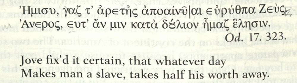
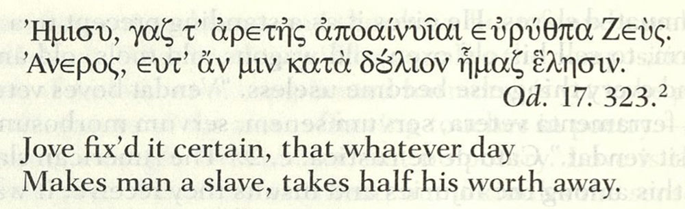
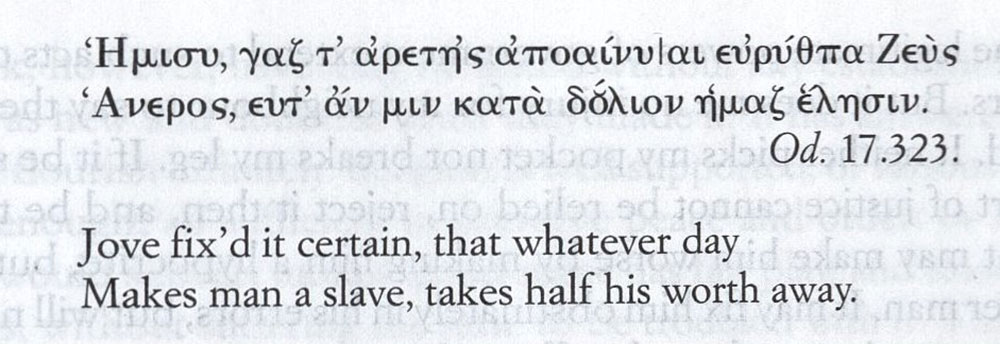
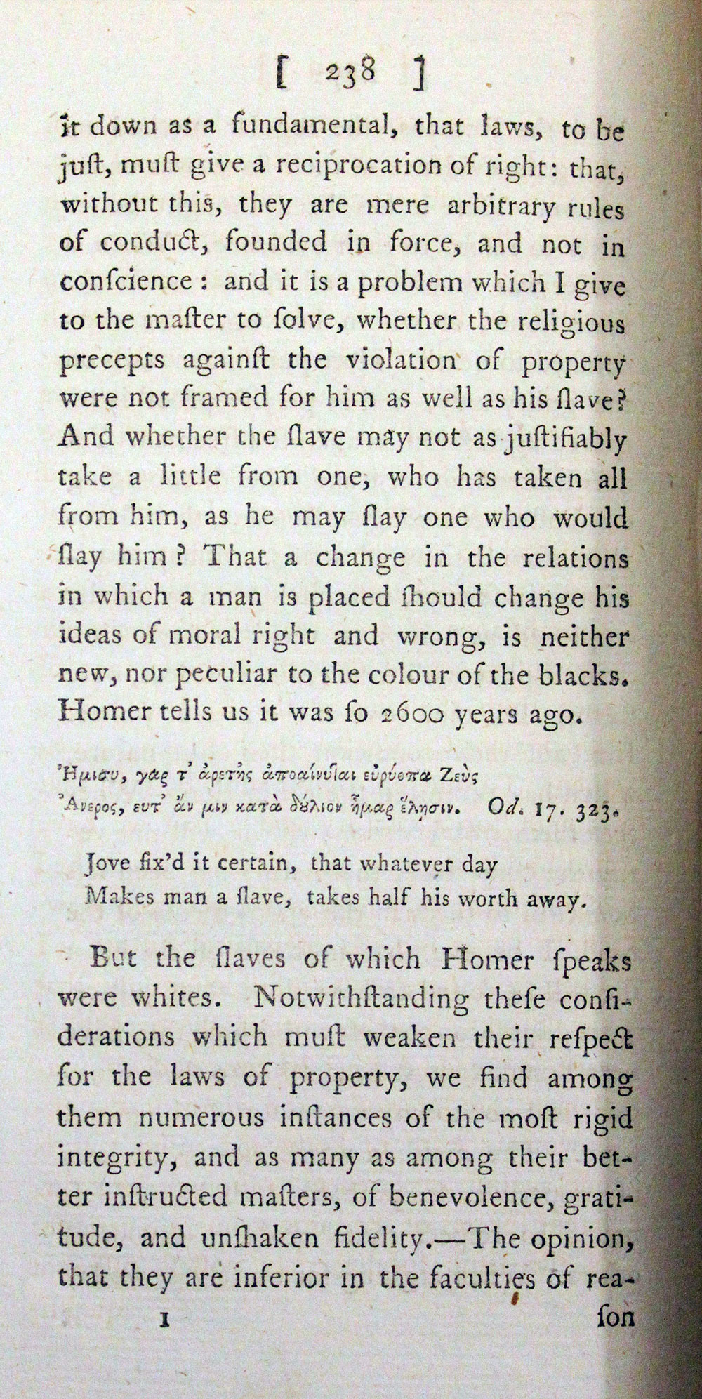
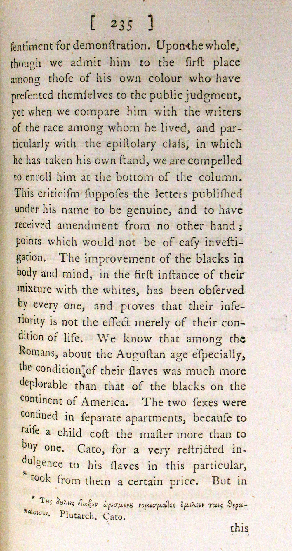
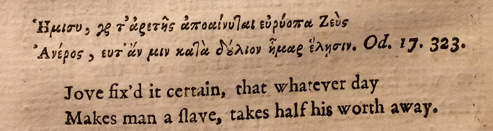
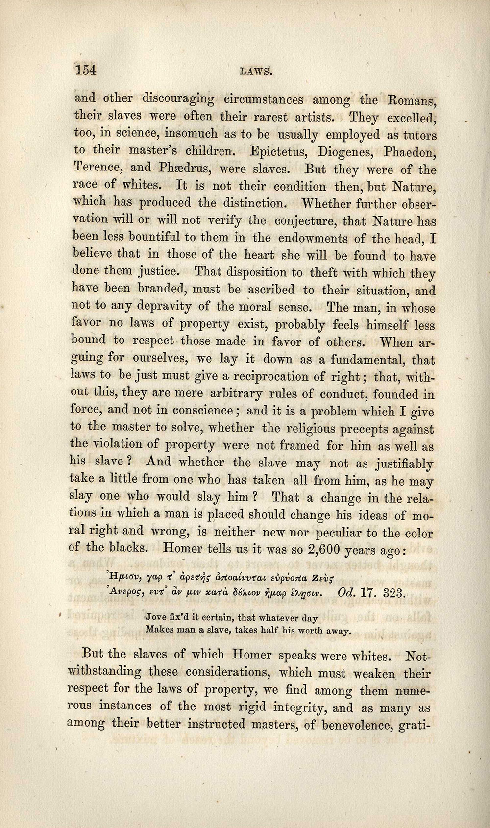
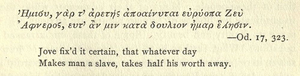
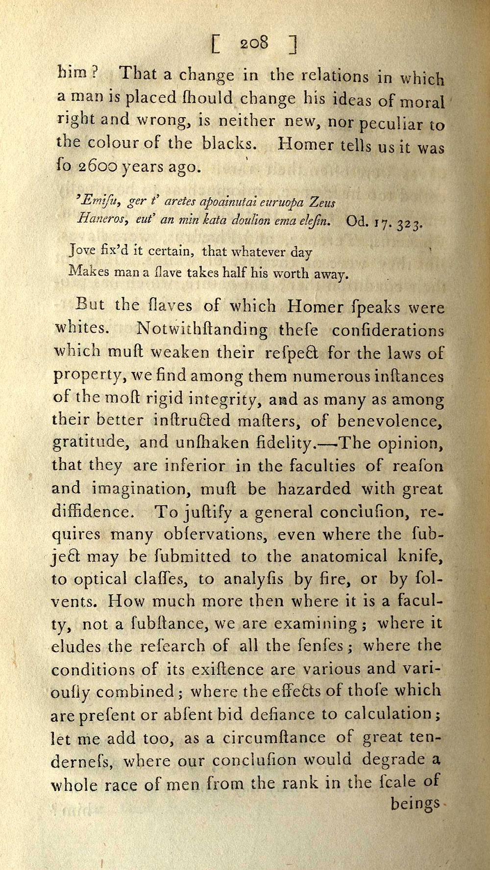
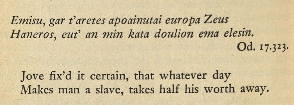
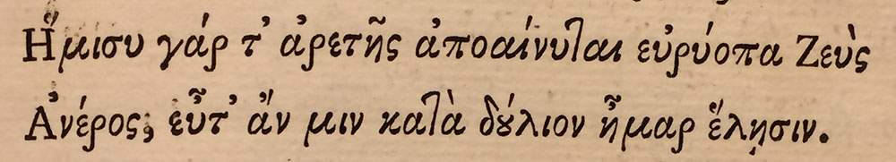
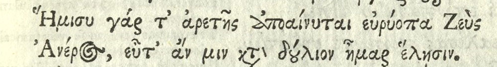
Apart from the legacy of typographical errors, we might still wonder about the appropriateness of Jefferson’s quotation from Homer and Pope for his purposes in Query XIV. Drawing on Longinus and Plato, Pope—or, more accurately, the scholars Elijah Fenton and William Broome who assisted Pope with the actual translation of Greek—suggest in the notes to their translation that Homer’s “very remarkable sentence” about slavery’s emasculating effects is “commonly found to be true.” Jefferson, too, plays on the conventionality of this epic wisdom when he contrasts what he considers the intellectual and moral achievements of Roman and Greek slaves against their African counterparts. Even so, despite Jefferson using Homer to solidify and adorn his argument about slavery, Homer, at least lexically, seems to have been relatively uninterested in slavery. As W. B. Stanford comments in his twentieth-century edition of the Odyssey, “references to slavery and slaves” occur significantly less frequently in Homer “than in later Greek.” Indeed, Stanford counts only seven instances of variations of δούλιον—the word in Jefferson’s quotation for slave—in all of Homer’s writing.

In drawing from Homer, then, we might accuse Jefferson of an (historical) presentism. Jefferson invokes Homer not on Homer’s own terms but as part of an undifferentiated classical world upon which a modern, European concept of a racial hierarchy depended. In other words, classical learning, for Jefferson, Thomson, and their peers, served to define blackness while subtly enacting (with ironic effect) their own whiteness. Appreciating this history can help us understand not only Jefferson’s own definition of race but also, for instance, the nuances in the debates 120 years later between Booker T. Washington and W. E. B. Du Bois about whether African Americans should bother studying Greek and Latin in the aftermath of slavery and Reconstruction. At issue is not who can or cannot learn Greek. Rather what seems to matter is who can claim racial kinship through Greek and what meaning resides in the form of classical learning. That, as the checkered history of the Greek in Notes suggests, is the (racial) difference that Greek makes.

Acknowledgments

I could not have put together all of the pieces in this history on my own. Leah Price was a terrific guide through the detective process of British book history. Ann Blair gave some very helpful citations about the lack of Greek fonts in the U.S. in the eighteenth century. And Hope Mayo at Houghton Library provided crucial technical wisdom on the identification of the Greek font in Notes. At Common-place, Hunt Howell and Anna Mae Duane offered indispensable feedback on drafts of the essay. Jackie Penny assisted me in tracking down the many images I have here.

Further Reading

A good starting place to appreciate the sheer number of editions of Notes on the State of Virginia is Coolie Verner, A Further Checklist of This Separate Editions of Jefferson’s Notes on the State of Virginia (Charlottesville, Va., 1950) and Coolie Verner and P. J. Conkwright, “The Printing of Jefferson’s Notes, 1793-94,” Studies in Bibliography 5 (1952): 201–3. More recently, several authors have investigated Jefferson’s punctilious attention to the printing of his books and the books that he purchased: Gordon S. Barker, “Unraveling the Strange History of Jefferson’s ‘Observations Sur La Virginie’,” The Virginia Magazine of History and Biography 112:2 (2004): 134–77; Alice H. Lerch, “Who Was the Printer of Jefferson’s Notes?” in Bookmen’s Holiday: Notes and Studies Written and Gathered in Tribute to Harry Miller Lydenberg, ed. Deoch Fulton (New York, 1943): 44–56; Eric Stockdale, “John Stockdale of Piccadilly: Publisher to John Adams and Thomas Jefferson” in Author/Publisher Relations during the Eighteenth and Nineteenth Centuries, eds. Robin Myers and Michael Harris (Oxford, 1983): 63–87; David R. Whitesell, “Thomas Jefferson and the Book Arts,” Printing History 24:2 (2005): 3–24. In 2014, John O’Brien and Brad Pasanek at the University of Virginia also put together a useful online edition of Notes that pairs a transcription of the text with page images from Jefferson’s copy of Stockdale’s 1787 printing and the French 1784-1785 edition. This edition is available here. It uses the digitized copy of Jefferson’s copy of Notes from UVA, available here. The manuscript of Notes is available from the Massachusetts Historical Society. The quotation in Greek appears on page 86 of the manuscript.

If you are interested in Jefferson’s knowledge of and interest in the classics, a good starting place is a collection of essays edited by Peter S. Onuf and Nicholas Cole: Thomas Jefferson, the Classical World, and Early America (Charlottesville, Va., 2011). As I mention above, Emily Townsend Vermeule identifies one of Jefferson’s errors explicitly in “Jefferson and Homer,” Proceedings of the American Philosophical Society 137:4 (December 1993): 689–703. The meaning of the classics for the educated elite in the eighteenth century is carefully explained in both Caroline Winterer’s The Culture of Classicism: Ancient Greece and Rome in American Intellectual Life, 1780-1910 (Baltimore, 2002) and Carolyn D. Williams’s Pope, Homer, and Manliness: Some Aspects of Eighteenth-Century Classical Learning (London, 1993).

I gathered information on Phillis Wheatley’s education from Vincent Carretta, Phillis Wheatley: Biography of a Genius in Bondage (Athens, Ga., 2011). Carretta speculates on Wheatley’s lack of knowledge of Greek on page 40. On Jefferson’s (lack of) criticism of Wheatley, see William Huntting Howell, Against Self-Reliance: The Arts of Dependence in the Early United States (Philadelphia, 2015): 46-81. For a sense of debates about race and the classics, I am indebted to Sarah Wagner-McCoy, “Virgilian Chesnutt: Eclogues of Slavery and Georgics of Reconstruction in the Conjure Tales,” ELH 80:1 (March 15, 2013): 199–220. The footnote from W. B. Stanford is on page 291 of volume two of The Odyssey of Homer, ed. W. B. Stanford (London, 1948). The footnote by Alexander Pope’s scholarly counterparts is from page 163 of volume four of Alexander Pope, The Odyssey of Homer (London, 1726).

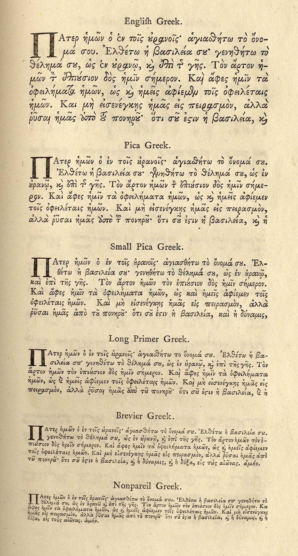
To figure out who did the printing for Stockdale and what type they used, I consulted both primary accounts of eighteenth-century printers and twentieth-century histories of the changes in Greek fonts. A crucial clue in figuring out Stockdale’s printer was the list titled “Books Printed for John Stockdale, Piccadilly,” which is bound in the back of Houghton Library’s copy of Hester Lynch Piozzi, Retrospection: or A Review of the Most Striking and Important Events, Characters, Situations, and Their Consequences, which the Last Eighteen Hundred Years Have Presented to the View of Mankind (London, 1801). With the Hansards in mind, indispensable primary accounts were Luke Hansard, The Auto-Biography of Luke Hansard: Printer to the House, 1752-1828, ed. Robin Myers, Printing Historical Society Publication, no. 15 (London, 1991); T. C. Hansard, Typographia: An Historical Sketch of the Origin and Progress of the Art of Printing; with Practical Directions for Conducting Every Department in an Office: With a Description of Stereotype and Lithography. Illustrated by Engravings, Biographical Notices, and Portraits (London, 1825); Philip Luckombe and William Caslon, A Concise History of the Origin and Progress of Printing; with Practical Instructions to the Trade in General (London, 1770); Edward Rowe Mores, A Dissertation upon English Typographical Founders and Founderies (1778). With a Catalogue and Specimen of the Typefoundry of John James (1782), eds. Henry Carter and Christopher Ricks (London, 1961). I supplemented these with biography and general history of printing at the end of the eighteenth century: Ellic Howe, The London Compositor: Documents Relating to Wages, Working Conditions and Customs of the London Printing Trade, 1785-1900 (London, 1947); D. F. McKenzie, Making Meaning: “Printers of the Mind” and Other Essays, eds. Peter D. McDonald and Michael F. Suarez (Amherst, Mass., 2002); Talbot Baines Reed and A. F. Johnson, A History of the Old English Letter Foundries: With Notes, Historical and Bibliographical, on the Rise and Progress of English Typography (London, 1952); J. C. Trewin and Evelyn Mansfield King, Printer to the House: The Story of Hansard (London, 1952).

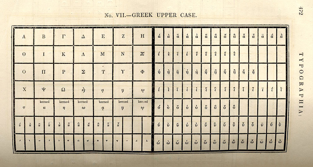
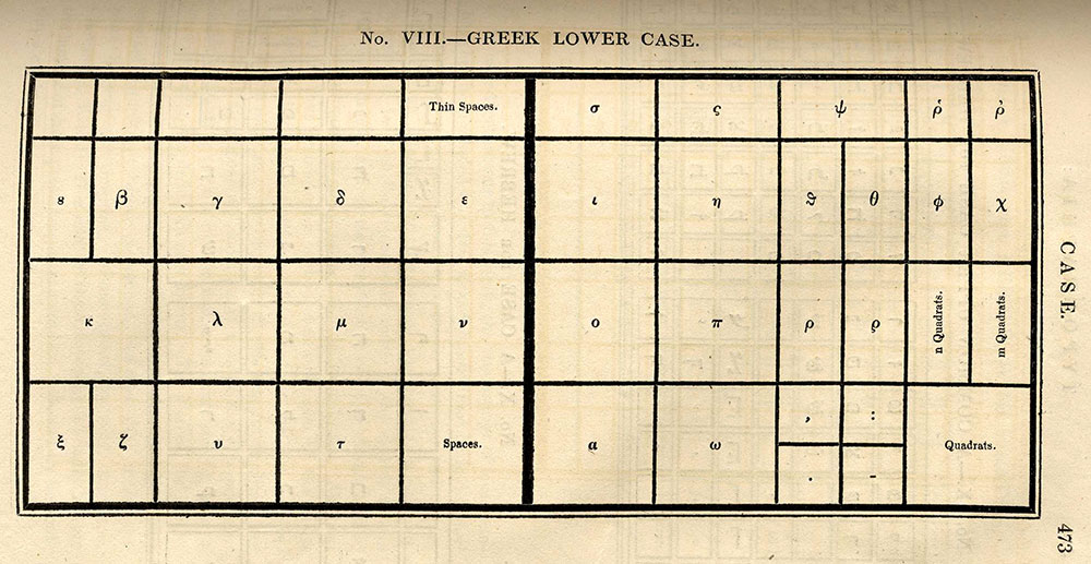
In identifying and tracing Greek fonts, the single most invaluable resource is the incredibly careful catalog and description by J. H. Bowman: Greek Printing Types in Britain: From the Late Eighteenth Century to the Early Twentieth Century (Thessaloniki, 1998), which is based on a 1988 dissertation of the same title at the University of Reading. The essays by John A. Lane and Bowman in the volume edited by Michael S. Macrakis also provided some useful information about the changes in Greek fonts as well: Greek Letters: From Tablets to Pixels (New Castle, Del., 1996). An older volume produced by the Printed Books Department at the British Museum also provided some useful examples of Greek fonts: Greek Printing Types, 1465-1927: Facsimiles from an Exhibition of Books Illustrating the Development of Greek Printing Shown in the British Museum, 1927 (London, 1927). I also consulted Klimis Mastoridis, “Cutting and Casting Greek Types in the Nineteenth and Twentieth Century,” Gutenberg-Jahrbuch 81 (2006): 306–41; Meyer Reinhold, Classica Americana: The Greek and Roman Heritage in the United States (Detroit, 1984).

If you, dear reader, are still here, I imagine you are of hearty enough stock to be interested in seeing what Greek fonts looked like before their simplification at the end of the eighteenth century. If so, I direct you to: William H. Ingram, “The Ligatures of Early Printed Greek,” Greek, Roman and Byzantine Studies 7:4 (Winter 1966): 371-396; William Wallace, “An Index of Greek Ligatures and Contractions,” The Journal of Hellenic Studies 43 (1923): 183–93.


This article originally appeared in issue 17.2 (Winter, 2017).


David Weimer is the librarian for cartographic collections and learning at the Harvard Map Collection. His article on Harriet Beecher Stowe, political economy, and religion appeared in J19: The Journal of Nineteenth-Century Americanists and his exhibition, Where Disaster Strikes: Modern Space and the Visualization of Destruction, is on view at the Harvard Map Collection until April 2017 and at its Website. He received his PhD in English from Harvard University in 2016.