The Arts of the Americas Wing opened with great fanfare on November 20, 2010, at the Museum of Fine Arts, Boston. This grand wing, designed by Foster and Partners, boasts 53 galleries, more than 5,000 works of art, and over 133,000 square feet, with a dramatic glass courtyard and gallery space, along with a grand new name. The half a billion-dollar expansion of the museum intends to offer a hemispheric perspective, uniting the traditional United States with Native North America and Central and South America. The new space and the occasion aspire to a “new” way of viewing, seeing, and understanding works of art—and the museum and its curators have promoted this widely. Much comes across as innovative and opulent, in my opinion: the lavish architectural setting, the unified approach to the Americas, the bringing together of work in various media, and the extensive multimedia program. These aspirations can be measured by numbers, evidenced in the Facts and Figures on the museum’s website. More significantly, they can and should be measured in the new ways visitors learn to understand the art collections, the primary purpose of a museum. The unique chance to re-install a major museum’s collection from scratch and in an expanded space comes only every few generations.

Well, how successful are they in Boston? A mixed bag, I would say. Certainly the space is grand, although some of the architectural reviews have found the Foster design to be cold (fig. 1). The Shapiro Family Courtyard with its New American Café has been humanized by installations; during my recent visit in May there was a marvelous and enormous Dale Chihuly glass piece in the courtyard—very green and tall—that visitors repeatedly stood before, while peering up and gasping. The four floors of galleries allow for a comprehensive setting that moves over the centuries and the continents, making for interesting juxtapositions of galleries and objects. Visitors enter the series of central galleries from the courtyard. Additional galleries lie off passageways along with the two “Behind the Scenes” galleries. The chronological and the geographical organize the two central floors that move from the early eighteenth to early twentieth centuries (fig. 2). In these galleries, the museum’s curators have been able to unite many of its familiar objects with less familiar ones that had formerly been relegated to storage, more than doubling what had been on view before. Along with “the rebirth of masterpieces,” or those favorites that visitors expect to see, such as Thomas Sully’s Passage of the Delaware (fig. 3), comes the unexpected and the unknown. This setting and arrangement certainly seem to justify the hype surrounding the opening.

But after two extensive visits, I’m not so sure. I will focus my discussion on the late eighteenth- and nineteenth-century galleries and materials. I applaud the “en suite” installations where paintings stand before furniture, needlework beside silver: the fine and decorative arts are no longer consigned to different spaces. While the museum had done this mixing before in its American galleries, the results here are quite striking. Most dramatically as you enter on the first level from the courtyard, you see the museum’s perhaps most iconic object, the John Singleton Copley portrait of Paul Revere(fig. 4) but standing before, in a vitrine, is the Sons of Liberty Bowl (1768). The silver bowl can be seen as a political declaration on its own from its inscription and iconography (fig. 5). Further on in this gallery of Revolutionary Boston (fig. 6) is displayed the clothespress owned by Gilbert DeBlois, a wealthy merchant and prominent loyalist. The history of this object facilitates a discussion of the trade and consumption of textiles and the important story of loyalists in Revolutionary Boston. Such an arrangement begins to approximate a setup of the cultural context for the visitor, so he and she can explore the material culture of a particular time and place. Context is given greater emphasis in certain areas such as the neoclassicism gallery on the first floor, entitled “At Home in the New Nation,” next to the central “Art in the New Nation” (fig. 7) that is dominated by Sully’s monumental painting (fig. 3). Here various object groups, such as paintings and textiles or fashion and clocks, complement each other, toward the larger goal of portraying how men and women in the early Republic utilized neoclassical themes as they created a new government and a new culture. Indeed, I applaud the clever idea to lay out the gallery as a gendered space—after entering and seeing the initial display of the gallery on “Neoclassical Dining,” you must go either to the left of the display or the right. If you choose the left, you have a series of objects interpreted as “Men in the New Nation” with Duncan Phyfe furniture and portraits of elite men. If you go to the right, you encounter a display of domesticity and “Women in the New Nation” with a lady’s writing desk and a piano on view. This approach is subtle but effective as a way to lead the visitors to view the spaces as separate spheres. The labeling overall and in this gallery is concise and often contextual. Instead of working from the succession of styles, neoclassicism becomes embedded in the search for a national culture in the decades after the War for Independence and that culture also becomes depicted as gendered.

This possibility is not realized throughout. More to the point, while neoclassical galleries feature cosmopolitan cities and patrician classes, contemporaneous worlds are relegated to distant side galleries where far fewer visitors venture. The possibilities for breaking up categories, one of the lofty aspirations stressed in the museum’s promotions about mixing continents and media, doesn’t get taken far enough in the Arts of the Americas Wing. Putting the “Rural and Vernacular Arts of the Eighteenth Century” on the first floor and the “Folk Art” gallery on the second floor, and at some distance from the central galleries, a rather conventional grouping, misses an opportunity to think seriously about the relationship of the academic and the provincial, the commercial and the amateur, and the spectrum of art makers. It is much easier to leave the folk alone, putting commercial portraitists such as Erastus Salisbury Field or Rufus Porter across from weathervane makers. Why not put Winthrop Chandler’s 1770 portrait of the Connecticut minister Ebenezer Devotion next to a John Singleton Copley portrait of a Boston merchant, and try to explain how these two worlds—artistic and social—exist contemporaneously in Revolutionary-era New England? This kind of installation could lead the visitor to the question of why some sitters might patronize Chandler’s style as “cousins to high-style urban pieces,” as the wall label says, and teach us about these period ways of seeing.

What seems on first glance to be a breakthrough installation turns out to be much less adventurous on closer examination. We find the “Latin America before 1900” gallery situated between a “Regional Styles in the Eighteenth Century” space and the flanking “American Artists Abroad around 1800.” “Regional Styles” displays regional preferences in portraiture, furniture and silver. It features a striking wall of eighteenth-century chairs that shows visitors how to look at the structural forms of the chairs to discover the methods of the craftsmen or the taste of the patron. The case “Three Coffee Pots, Three Cities” about silver in Boston, New York, and Philadelphia, emphasizes those northeastern British ports as style centers. Still, the gallery labeling and display, along with the central gallery on “Eighteenth-Century Boston,” push us to think about how these cosmopolitan port cities were embedded politically and culturally within the Atlantic world. Then the Latin American gallery features objects and text about the work of indigenous artisans, the role of the Catholic Church in commissions, and the movement of Asian goods and designs across the Pacific—a welcome corrective to our current Atlantic World predilection—along with discussions of racial categories in “Casta Painting” and the introduction of horses to the Americas in a display on “Silver for Horses.” The labeling in this gallery leans to the cultural and historical, compared to the adjacent ones. It recognizes the burden of providing an overview of Spanish Empire in the Americas in a few sentences, but the effort seems more token than consistent. These contiguous galleries inform us about the nature of art in the colonial Americas, but visitors could use more explicit connections between, for example, the Atlantic or Pacific orientation of mercantile life and the relative role of the church in artistic life.

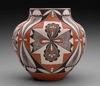
Or worse, the “Native North American Art” gallery sits along with those about “Mesoamerica, Marine Art, Embroidery, and Seventeenth-Century New England” in the lower ground level, where fewer visitors venture. Seemingly harder to integrate with the rise of an American art narrative, Native American art is organized according to the convention of regional traditions. The curators also decided to intersperse contemporary objects, such as the 1993 olla or water jar (fig. 8), amid historical ones. This is an interesting mode of display, one that the Museum of Fine Arts and other art museums have used to great effect. But in the new wing, where it is only done in this Native American gallery, it promotes, however unintentionally, the falsely ahistorical and timeless world of Native America.

Accompanying the broadening of the story of American art comes a deepening of that experience in a series of multimedia installations—”Behind the Scenes Galleries,” multimedia handhelds, and touch screens in the galleries. The Museum of Fine Arts conducted focus groups and in-depth interviews with visitors to learn that they desired knowledge about how the curators and conservators go about their work and how decisions were made about what to include in the collection and exhibit in the galleries. Along those lines, I found the “Behind the Scenes Galleries” to be most innovative in their compelling focus on questions of collecting and conservation, classification and curatorial choice. The ample space devoted to these areas is located literally behind the galleries, and that means that they receive a lot less visitation; however, those who do notice and venture over to the galleries are rewarded by some striking media walls with images from many aspects of museum work. For example, a large touch screen with an array of teapots awaits the visitors’ attempts to organize them, by style or in chronological order; or to make decisions about which early national portrait should receive gallery installation, according to particular thematic concerns. This interactive display provides ample additional information to facilitate the visitor’s interests and choices. These presentational materials on the two levels open up a proverbial black box about how the museum makes certain choices, but they transcend the “talking head” curator presentation to achieve a more robust interactive experience where visitors make decisions grounded in the additional information. Short of asking visitors to rearrange the galleries, these sorts of multimedia-facilitated experiences provide an alternative and compelling way to understand how and why certain objects enter a collection and receive space in an installation.