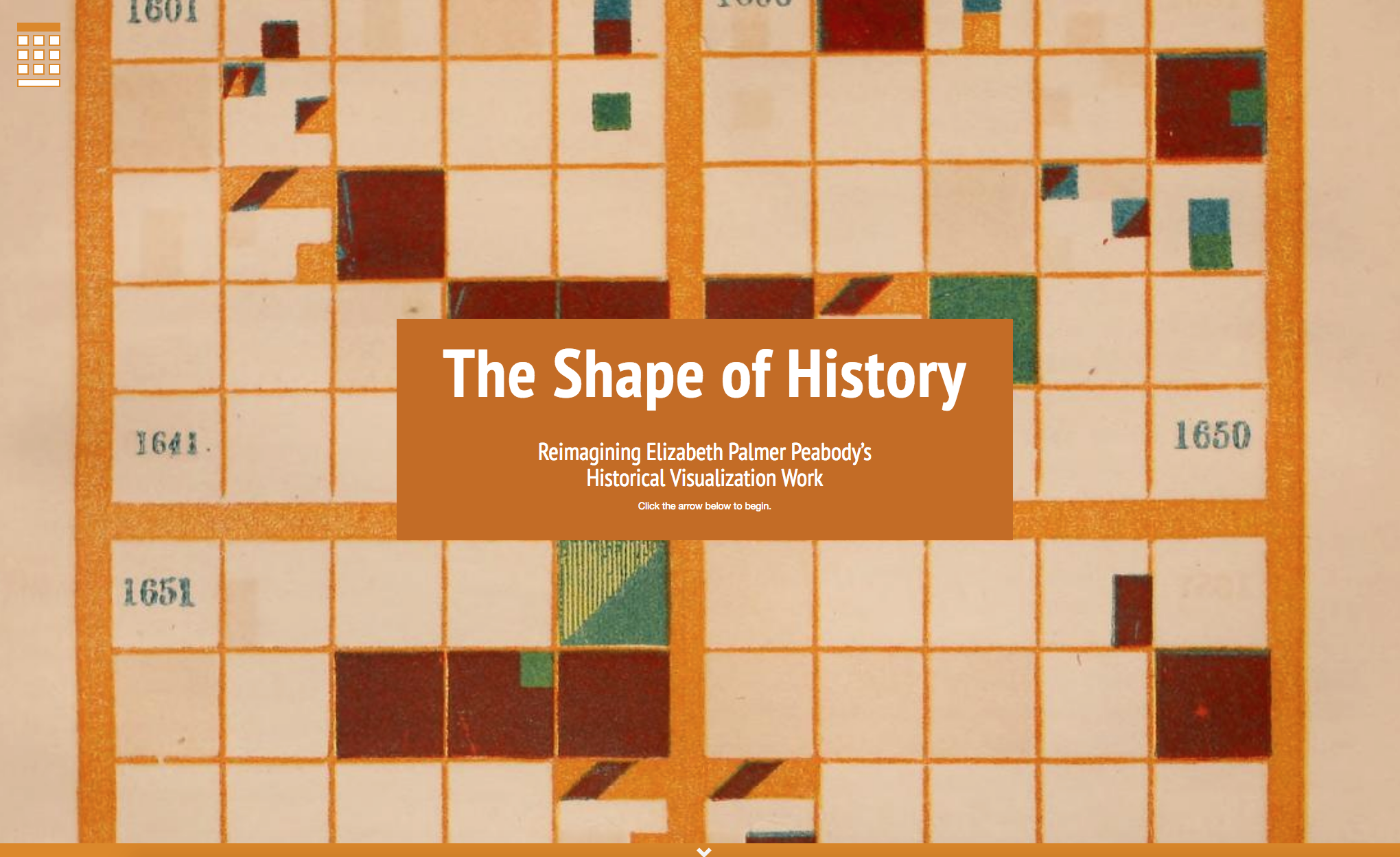
When Elizabeth Palmer Peabody traveled by railcar publicizing her textbook A Chronological History of the United States (1856), she carted a fat fabric roll containing samples of her iconic historical grids. Students who studied Peabody’s textbook would translate her tables of historic events into colorful, 100-square visualizations, with each square representing one year. For every box-shaped year in a century-long history, students demarcated the countries involved in an event by color, and the event’s type by its position—wars, revolutions, or disasters, for example, would appear in a different location within each year’s square. The result, for the most diligent students, was a mosaic of multi-colored squares and triangles exploring a century’s trajectory in the abstract. For every classroom that purchased a textbook set, Peabody would make a large-scale fabric grid as accompaniment, a task she described as backbreaking labor (none of these full-scale models survive).
Lauren Klein, Caroline Foster, Erica Pramer, Adam Hayward, and Shivani Negi, The Shape of History: Reimagining Elizabeth Palmer Peabody’s Historical Visualization Work. The Georgia Tech Digital Humanities Lab, 2016.
In Lauren Klein’s digital project The Shape of History, and in conference presentations, articles, and her current book-in-process on the topic, she asks what Peabody’s grids might contribute to the development of an embodied, affective, and feminist approach to data visualization. Klein’s most detailed explanation of the project, her 2017 Modern Language Association presentation “Feminist Data Visualization: Or, the Shape of History,” argues that Peabody saw the labor of completing her grids as a generative act:
Peabody devised her method at a moment of great national crisis—the decade leading up to the Civil War—and she recognized that the nation’s problems would be difficult to solve. Her goal was to prompt an array of possible solutions—one coming from the creator of each chart. And her hope was that, by designing new narratives of the past, her students would also imagine alternate futures.
In our own historical moment, infographics and other data visualizations are consumed as pleasing visual synopses that distill complex ideas, as exemplified by the Canva Design School’s “Topics Explained Perfectly by Infographics.” By returning to the archive to find models of data visualization, Klein has uncovered a nineteenth-century antecedent that uses the visual not merely to clarify information, but to engage audiences in the emotional possibilities of a complexly rendered historical narrative, to help them tell visual stories about history as a way to imagine new outcomes.
For scholars seeking to legitimate the digital humanities, it has been necessary to explain how labor and process can both inform scholarly production and be scholarly products in themselves. The dominant terms in this discourse, like Stephen Ramsay’s “building” or Jentery Sayers’s “tinkering,” are historically associated with masculine labor. In contradistinction, Klein situates Peabody’s grids within a feminine matrix of scholarly and artistic production. Though observers have noted the grids’ resemblance to Piet Mondrian’s art, for example, Klein finds a more likely modernist descendent in the quilts painstakingly crafted by a small community of African American women in Gee’s Bend, Alabama, who explored the form and function of narrative in the triangles and squares of their textiles. Like the quilts of Gee’s Bend, Peabody’s grids emphasize the embodied labor of designers and, says Klein, “affirm the role of pleasure and the senses.” In Klein’s talk, she shares the grid of a student who was daunted by the task of coloring in each event; he or she instead created a kaleidoscope of full-page triangles. A critical awareness of the process of working, and sometimes failing, to conceptualize history and its possible futures, says Klein, is what the humanities can offer data visualization. In other words, the humanities provide a means of embracing a practice that is contextualized, often emotional, and always process-oriented. Here Klein is synthesizing nineteenth-century scholarship with affective design and computing, which studies how new technologies can meaningfully elicit and respond to human emotion. Klein’s digital project attempts to bring this idea to fruition in contemporary data visualization.
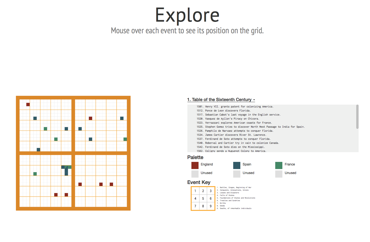
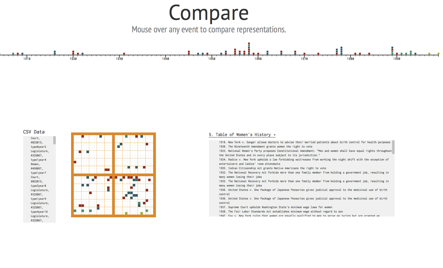
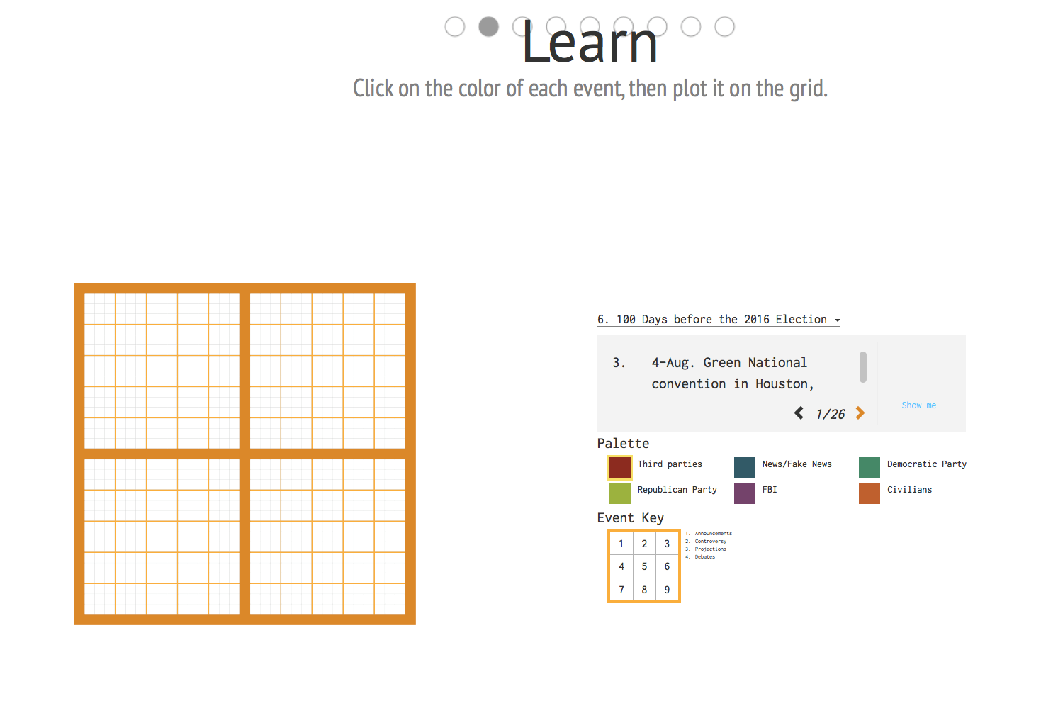
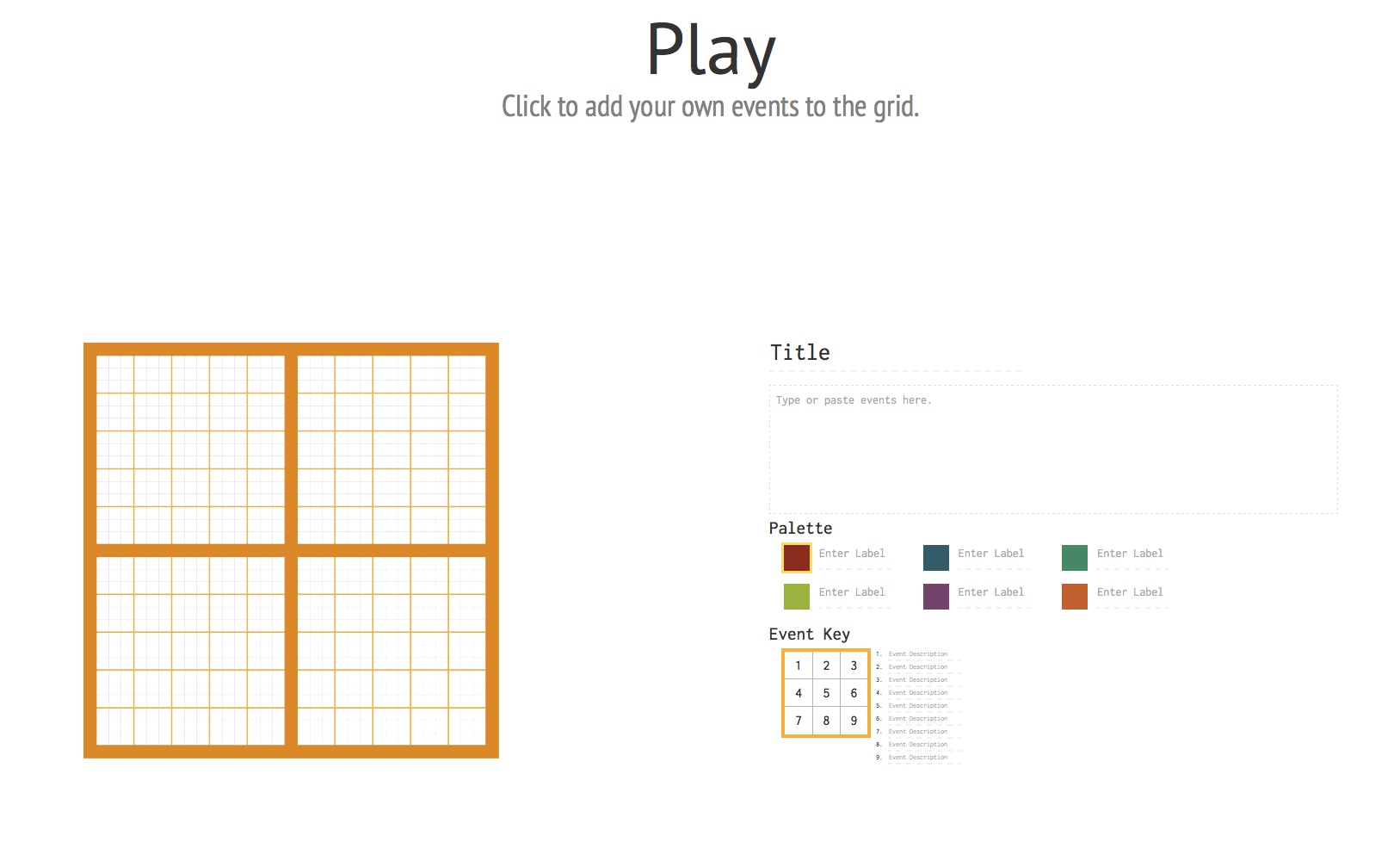
Klein and her collaborators—Caroline Foster, Erica Pramer, Adam Hayward, and Shivani Negi—have designed the site with squares that invite users to meander in all directions, mimicking the multiple pathways available in Peabody’s grid. The “Explore” square offers completed grids, including renderings of Peabody’s century-long tables as well as new tables detailing women’s history since 1918 and the 100 days before the 2016 U.S. presidential election. The “Compare” square puts Peabody’s grid alongside a traditional timeline to consider how straight chronology simplifies history by ignoring cross currents. With the “Learn” square, users can color the grid using the provided tables, whereas “Play” provides a space to devise an original table on any topic and map it on the grid.
Lauren Klein, Caroline Foster, Erica Pramer, Adam Hayward, and Shivani Negi, The Shape of History: Reimagining Elizabeth Palmer Peabody’s Historical Visualization Work. The Georgia Tech Digital Humanities Lab, 2016.
The team designed the project for a general audience, with the idea that a version of the site targeted at academic scholars would be launched later. Despite this caveat, the background information on Peabody delivers minimal insight into why someone would engage with this project who is not invested in the nineteenth-century or data visualization. Though the project is designed to guide readers through a thought experiment rather than provide an archive of Peabody’s grids, adding images of student grids could provide users with a more informed, contextualized entry point.
Lauren Klein, Caroline Foster, Erica Pramer, Adam Hayward, and Shivani Negi, The Shape of History: Reimagining Elizabeth Palmer Peabody’s Historical Visualization Work. The Georgia Tech Digital Humanities Lab, 2016.
Klein expects her users to play, to dabble, to experiment with this blocked visualization of history, but she herself notes that, in terms of eliciting an emotional response, frustration may have been “the point.” Painstakingly deciding the color and placement of eighty-five historical events to complete a grid for the nineteenth century was enough to make me, like Peabody’s students, contemplate the futility of history. Yet, I’m reminded of Emily Dickinson’s work pressing flowers in her herbarium; she began with Linnean classifications but resorted to her own categorizations, more poetic in their placement than scientific. Dickinson created an embodied, aesthetic visualization that defied categorization just as Peabody’s grids encouraged her students to color outside of the lines in the hopes of understanding time and human history with fresh eyes. In Klein’s writing, the significance of recovering histories of feminist visualizations—like Peabody’s and Dickinson’s—is actually about unearthing previously undervalued ways of knowing to help us reframe our present and imagine those “alternate futures.” I’m eagerly awaiting her book, which will explain in greater detail how she imagines affective design from this contextualized feminist perspective.
Lauren Klein, Caroline Foster, Erica Pramer, Adam Hayward, and Shivani Negi, The Shape of History: Reimagining Elizabeth Palmer Peabody’s Historical Visualization Work. The Georgia Tech Digital Humanities Lab, 2016.
Further Reading
Klein’s 2017 co-authored article in Feminist Media Histories titled “The Shape of History” provides additional information. See also her talk “Visualization as Argument” from the Genres of Scholarly Knowledge Production conference and her accompanying blog post about that presentation, “Floor Charts on the Floor Screen.” For the 2016 Workshop on Visualization for the Digital Humanities, Klein collaborated with Catherine D’Ignazio on “Feminist Data Visualization,” an overview of best practices and helpful research for feminist data visualization. Finally, Klein and her collaborators at Georgia Tech’s Digital Humanities Lab are documenting their fabrication of an interactive floor model of Peabody’s grid.
Lauren Klein, Caroline Foster, Erica Pramer, Adam Hayward, and Shivani Negi, The Shape of History: Reimagining Elizabeth Palmer Peabody’s Historical Visualization Work. The Georgia Tech Digital Humanities Lab, 2016.
This article originally appeared in issue 18.1 (Winter, 2018).
Jessica DeSpain is an associate professor of English at Southern Illinois University Edwardsville and is the co-director of SIUE’s IRIS Center for the Digital Humanities. She is the author of Nineteenth-Century Transatlantic Reprinting and the Embodied Book (2014), and the lead editor of The Wide, Wide World Digital Edition, an exploration of the more than 170 reprints of Susan Warner’s bestselling nineteenth-century novel. She has published several articles on the intersections of book history and digital humanities pedagogy. DeSpain is currently collaborating with scholars in English, history, education, and STEM on the NSF-funded Digital East St. Louis Project, in which middle school students in East St. Louis collaborate to build a digital project about the history and culture of their city.