New ways of seeing old faces
After George Washington’s death on December 14, 1799, pictorial tributes poured from the presses. During his life, engravings had established Washington’s face and his symbolic role among contemporaries. But the historic death of the first president and former commander in chief fed a growing appetite for inexpensive printed portraits, which would persist for the rest of the century. Though their popularity suggests that these portraits somehow spoke to Americans, an important question remains: exactly what did they say?
How can we know what an individual print communicated to its audience at the time? With paltry written evidence about reception or audience reaction, can we responsibly use these prints as historic documents? As we review a range of nineteenth-century printed portraiture, let us consider several techniques that will help us sharpen our perceptions of what these images really meant.
The engravings published after Washington’s funeral encompassed various approaches to death, grief, and glorification. Some printmakers delivered recognizable, bust-length portraits of Washington, based on paintings by Gilbert Stuart, Edward Savage, and other artists. Some enhanced the portrait with elements of neoclassical mourning art, including urns, obelisks, willow trees, and weeping Indians or female goddesses representing Columbia. Others heroicized the portrait with symbolic attributes such as eagles, seals, liberty caps, laurel wreaths, and allegorical figures of fame. A few popular examples granted Washington full-scale apotheosis with classical, religious, or Masonic imagery (fig. 1). Russian visitor Paul Svinin, traveling in America from 1811 to 1813, commented that “every American considers it his sacred duty to have a likeness of Washington in his home, just as we have images of God’s saints.”
No other figure, even Benjamin Franklin, had occasioned this much pictorial output from the American press. Through the rest of the nineteenth century, artists, audiences, and public figures all assumed that relatively inexpensive and easily reproduced portraiture was a necessary fact of American life. Abolitionist William Lloyd Garrison complained in 1833 that “this sticking up of one’s face in print-shops, to be the ‘observed of all observers,’ is hardly consistent with genuine modesty.” Nonetheless, he sat for his portrait, so that it could be engraved.

So how do we interpret such pictures? It is crucial to start by understanding the physical object and its medium, questioning how, why, and by whom it is made and disseminated. Even the length of time it took to produce an image can change its significance. Political elections, for instance, always provided an opportunity for print sellers. But because the engraving process was slow, printed pictures rarely had any real impact on electioneering, at least until later in the century when new technologies sped the reproduction process. Neither of the rival publishers who announced ambitious full-length engravings of Thomas Jefferson during the 1800 presidential campaign had them ready until months after the inauguration. But even if they were not utilized as campaign material, these portraits still had a political element. We know from newspaper advertisements, for example, that Philadelphia publisher George Hembold Jr. sold his image of Jefferson, engraved by David Edwin, in sixteen other cities as well; often his agents were the publishers of partisan Republican newspapers that had supported Jefferson all along (fig. 2).
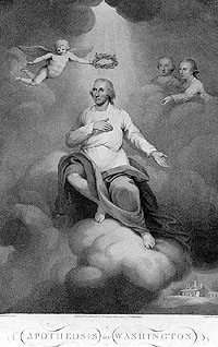
Understanding the conventions of the genre is also important. Political portraits heroicized their subjects, often utilizing a traditional “grand manner” pose in front of a background column and drapery. The books, documents, writing implements, and elegant table and chair in the Jefferson engraving were also features of Gilbert Stuart’s famous “Lansdowne” portrait of George Washington, well known through printed copies. Although Jefferson’s head was copied from a painting by Rembrandt Peale, other details of the print were conventions, not artistic choices inspired by the man. Such images must be approached, therefore, with a degree of skepticism about the accuracy of details. A print of Abraham Lincoln by John Sartain, to pick an egregious example, was actually printed from a plate depicting Martin Van Buren, originally engraved about twenty-five years previously (fig. 3). By changing the head, the coat, and the background building, the publisher could quickly produce a dignified presidential image with all the expected components of high office.
In order to understand the genre, it is helpful to consider prints in the aggregate. If we question poses and interior details or wonder what emblematic, allegorical, or thematic iconography really meant to its audience, looking at a whole body of contemporary imagery and seeing how such elements are applied and repeated can help us deduce meaning. That is, when considered collectively rather than individually, prints may actually reveal more of a message.
Any print published in a book or in a series garners significance from the presence of other images or texts and should not be read alone. A relatively modest bust-length engraving of Daniel Webster by James Barton Longacre, for example, represents more than just a small, rather formulaic likeness of a prominent statesman. It was published in Longacre’s and James Herring’s ambitious, multivolume work, The National Portrait Gallery. The early nineteenth century was a golden age of collected, illustrated biographies, whose publishers risked financial ruin to assemble or commission accurate paintings, engravings, and biographical manuscripts. Within this context, the modest Webster print is part of an American pantheon, a collective grouping of statesmen and heroes that satisfied nationalistic impulses by revealing a narrative of American greatness.
In the late 1820s, the advent of lithography—the technique of drawing directly on a heavy stone, which could then be inked and printed—transformed the commercial world of printed portraiture. More than ever before, the public could demand an inexpensive, immediately available image of a newly famous minister, spokesman, singer, dancer, hero, or martyr. Lithography’s tonal qualities were especially appropriate for delineating features, and it could provide an infinite number of copies. Portraits were a staple of every lithography firm. Sometimes lithographic portraits were commissioned by painters or photographers wishing to reproduce their own work. More often they were commercial ventures on the part of publishers or lithography companies and produced in large quantities for public sale. The copyright line on the bottom of most of these prints is a useful source of information, indicating who took financial responsibility for their publication.

Pondering what a piece says biographically about its subject at the precise moment it was published is always a useful exercise. Since printmaking, for much of the century, was a commercial enterprise as much as an artistic one, the purpose of the print was often related to an event that would attract buyers. Was the subject newly deceased? retiring from the ministry? running for office? performing at a local venue? Biographical understanding also explains unusual details. The Frank Johnson of Alfred Hoffy’s compelling lithograph turns out to be a renowned Philadelphia band leader, acknowledged as the most accomplished bugle player in America (fig. 4). Johnson’s all-black band was a sensational success and, while on tour in England, was even awarded a silver bugle by an admiring Queen Victoria. But Johnson was also a composer, and the music manuscripts and inkstand on the table imply his contribution not just as performer but as a creator of the popular music of his day.
Biographical research on the makers of the picture can be equally revealing. Nineteenth-century portrait prints were typically copied from paintings, daguerreotypes, or photographs. If a painter’s name is included in the inscription, it is worth pursuing publications on the artist who painted the “source” portrait. Monographs or collection catalogues often provide detailed information about the original painting upon which the print is based. In the case of Frank Johnson, the inscription tells us the lithograph was based on a daguerreotype by R. Douglass Jr. and was “[p]ublished at the Arch Street Gallery of the Daguerreotype Philadelphia.” In the literature on photography, one discovers that Douglass was also African American. The inscription implies that he commissioned the lithograph as a way to advertise his skills in the daguerreian business. The print thus becomes a rich testament to the creative roles of free, black professionals in Philadelphia in the 1840s.
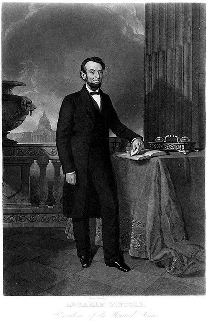
Since the prints were so often copied from other sources, reading psychological attitudes into images that were not made “from life” can be dangerous. First of all, a certain formality in posing and expression was the norm, so nineteenth-century audiences were not accustomed to extrapolating much emotional information even from the original painting or photograph. In addition, since the printmaker often had not met or seen the subject, his copy almost inevitably diminished the subtle understanding between sitter and portraitist. Starting in the 1850s, newspapers began to illustrate the news with wood engravings—relief blocks, which could be quickly produced and printed along with the text. Through such images, newspapers brought the public pictorial news of the Civil War’s recent battles as well as its emerging heroes and martyrs. But the viewer of a Harper’s Weekly picture of Robert E. Lee was one step removed from the perspective of the original photographers, Minnis and Cowell (fig. 5). The wood-engraved copy of that picture could convey a good deal of information, but subtle nuances were inevitably lost. Sometimes, for a large wood engraving, the block was even broken apart and cut by a team of wood engravers to shorten the production time. Another newspaper might copy the same photographic portrait and to our eyes it may seem gentler, less stiff, or more aggressive. But such emotional subtleties were not intended, and one should be wary of drawing from them much meaning.
The speed of production for both wood engraving and lithography increased the importance of prints in the political process. In 1849, a Hartford newspaper reported that the Kellogg Company lithography presses “run off daily from 3000 to 4000 copies of various popular prints . . . More than 100,000 copies have been sold from a single design.” Given such quantities, promotional portraits may well have come to influence the electorate.
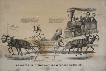
The single sheet lithographic cartoon, however, also became an expected element of political discourse and electioneering. By midcentury, some of these satiric broadsheets were printed in quantities from fifty to one hundred thousand and distributed to party headquarters or sold from newspaper offices. The prolific Currier and Ives Lithography company issued numerous cartoons in the election of 1860, for instance, targeting all factions. Instead of the caricatural distortion of features typical of later satiric portraits, these images featured easily recognizable, photographically derived faces. “Progressive Democracy,” for instance, features the dilemma of a bitterly divided Democratic Party (fig. 6). Stephen Douglas and running mate Hershel V. Johnson pull the “platform” one way while southerners John C. Breckinridge and Joseph Lane, driven by James Buchanan, strain in the other direction; Republican candidates Abraham Lincoln and Hannibal Hamlin gleefully anticipate the “prospect of smash up.” Widely available photographic and printed sources made each face immediately recognizable. The wood-engraved newspaper cartoons by Thomas Nast provided another form of visual campaigning: his iconic donkey and elephant symbols for the Democratic and Republican parties were as important as his satiric caricatures.
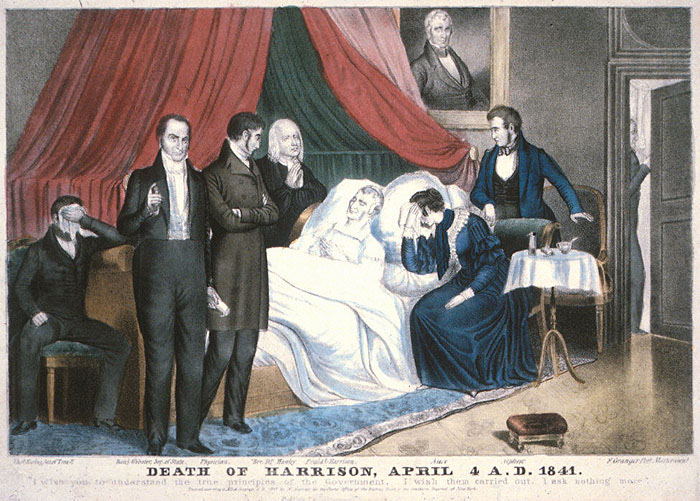
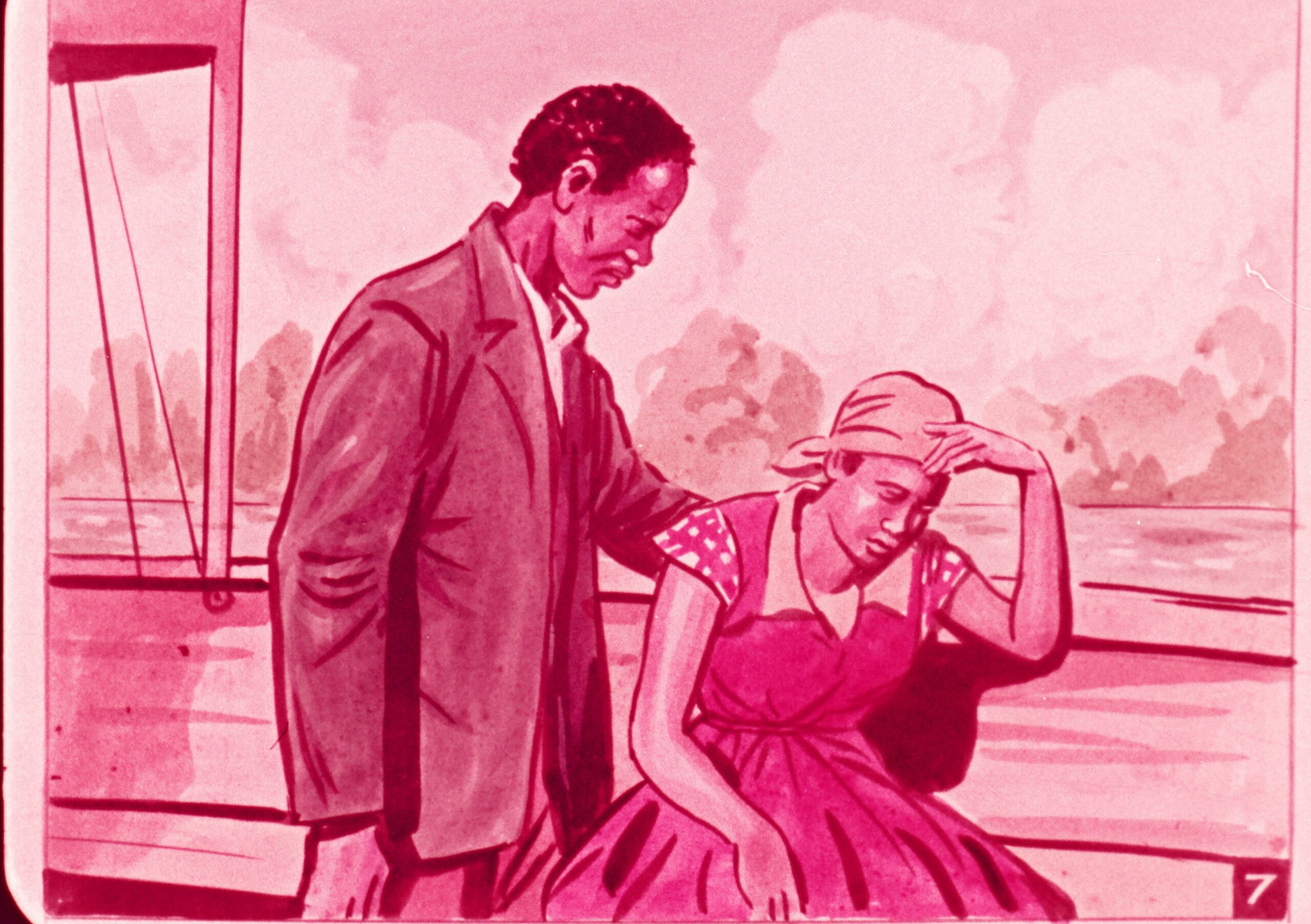
Sometimes portraiture appeared in guises unfamiliar to modern sensibilities. The allegorical, memorial, and apotheosis prints of the early part of the century gave way to deathbed scenes for prominent individuals. Clustered around the bed of a public figure would be grieving widows and children but also cabinet members or other notables. Inevitably such scenes as Nathaniel Currier’s Death of [William Henry] Harrison bore no resemblance to the actual circumstances of the final hours but reflected instead a public acknowledgement of death and grief that related to mourning clothes, black bunting, and other funereal customs of the day (fig. 7). Understanding those customs helps us to see that the death of a prominent individual was often considered a public act. George Washington’s stoicism, for instance, in the painful waning hours of his life was widely reported and remarked upon in orations and eulogies.

The family portrait of a public figure is another category of portrayal that seems unusual to us today. With the exception of Edward Savage’s painting and engraving of the Washington family (1798), the genre seems to have started with the death of Abraham Lincoln. William Sartain’s engraving of Lincoln’s family provided the prototype for these images. Including a bust of Washington and a portrait of the deceased child Willie, it appeared in 1866 after Lincoln’s own death and spawned many copies. Such prints don’t tell an accurate story of the Lincolns’ domestic life before he died; many of them resurrect Willie and most include the older son Robert who at that point was rarely home. But images of public men within their family circle reinforced that division in the Victorian mind between male and female spheres of influence. Military figures such as George B. McClellan, Stonewall Jackson, and Ulysses S. Grant were all depicted with their families (fig. 8). The man’s return to the feminine sphere of the parlor—filled with pictures, sculpture, books, furnishings, and children—recharged him with moral rectitude and emotional sympathy. Every president from Lincoln through William McKinley was depicted in a “first family” domestic picture until printmakers finally gave up with Teddy Roosevelt, whose sprawling White House entourage of children, pets, and a glamorous debutante daughter required more regular updating in the rotogravure sections of the newspapers.

Just as topical—and saleable—as images of presidents and generals were the portraits of theatrical figures. While lithographic music sheets of the early nineteenth century sometimes featured military heroes to whom the “grand march” could be dedicated, they most frequently depicted famous composers or touring actors, dancers, and singers. The importance of the piano as a social nexus in every well-appointed parlor adds to the significance of these often modest pictorial embellishments for the latest popular song sheet. Romantic tunes, stirring lyrics, and the frequent repetition of performance added to the appreciation of the subject, more than compensating for the artistic deficiencies of such boneless, weightless figures as singer Jenny Lind in the J. H. Bufford Company’s portrayal (fig. 9).

Theatrical portraits in differing mediums and varying quality were produced throughout the century. The strikingly photographic quality of the lithograph of actress Malvina Florence in her role as Peg Ann Higgenfluter in The Yankee Gal suggests that it might have been copied from a daguerreotype (fig. 10). The specificity of her features and expression, the extraordinary detail of the costume, and the clarity of the atmosphere all imply a daguerreian source. The lithographers of the time were proud of their ability to replicate the daguerreotype’s minute detail and startling, lifelike qualities; they strove for the same precision. Unlike other genres of printed portraiture, one can assume accuracy in these extraordinary prints after daguerreotypes. Malvina Florence may not have actually said, “How de dew Fellar,” to the photographer, as the inscription implies, but this is undoubtedly how she presented herself in character to his camera.
Eventually theatrical portraiture came in the form of posters. Are they reliable historical documents? Do the inevitable exaggerations of their advertising mission disqualify them as historical documents, or can we learn history lessons from their loud ballyhoo?
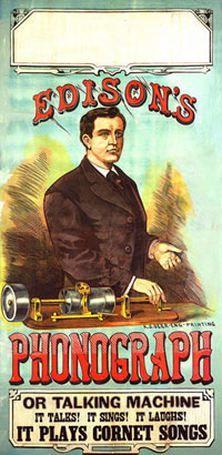
Consider a large wood-engraved poster of Thomas Edison, which on the surface doesn’t seem to have anything to do with theatrical traditions (fig. 11). In 1878, when Edison came to Washington to demonstrate his newly patented phonograph for the president, the Academy of Sciences, and Congress, he had his picture taken with his new invention. The same year, Edison had five hundred of his “talking machines” manufactured for exhibition around the country under the auspices of a lyceum, an organization that booked edifying and uplifting programs. This piece is, in essence, a show poster advertising the demonstrations of Edison’s machine. The blank space left purposefully at the top provided local promoters the opportunity to fill in the particulars of time and place. Edison did not accompany his machines on the circuit, but he appears prominently in this nearly seven-foot-tall poster. At the bottom, circus poster rhetoric informs the viewer about this extraordinary machine: “It Talks! It Sings! It Laughs! IT PLAYS CORNET SONGS.” This image and the man it represents would have been seen within the context of both the lyceum and the circus: a conflation of notions about education, entertainment, and pride in American invention. The poster reminds us that Edison, far from being that lone genius of American fantasy, was very much a public figure.

Posters were insistent, unsolicited visual statements, meant to be seen, as print historian A. Hyatt Mayor has suggested, “by people who did not mean to see them.” In order to capture attention, they were necessarily simple, graphically bold, and often large. Late nineteenth-century theatrical posters were more typically printed as brightly colored chromolithographs. In one sense the portrait is secondary in these images: the poster’s primary purpose is to advertise the arrival of the circus, the opening of the play, or the publication of a magazine. But because of their effective and dramatic combination of words and images, they communicate powerful messages about the subjects portrayed. The face in the Strobridge Company’s poster of singer Lillian Russell could advertise any of the sweet and youthful heroines of her many light opera roles (fig. 12). But the elaborate frame and the subtle color stippling of the background suggest the influence of the artistic poster craze on the large commercial printing firms. Strobridge’s unidentified artist posed Russell’s face against a marbleized wallpaper design and constructed an elegant frame, inspired by contemporary stained glass and ornamented with bamboo. The aestheticizing approach added more luster to this perennially popular performer whose beauty and flair for publicity had as much to do with her success as did her voice and her acting ability.
With the etching revival of the last two decades of the nineteenth century, prints became works of art, prized for beauty, rarity, and originality. But portraiture was never a major component of the etching revival. In this medium, prints simply could not compete with photography when it came to replicating the face.
In the end, printed portraits from the nineteenth century can be considered in commercial terms: pictures produced in quantity for a broad range of consumers. These portraits emphasized the public image rather than subtler, less well-known personality traits. They established or solidified fame, focusing consumers’ attention on the most commonly known and popular characteristics of famous Americans. By learning to read and understand these pictures, we can gain considerable insight into historical figures and how they were perceived in their own day.
Further Reading:
For several articles on these prints, see Wendy Wick Reaves, ed., American Portrait Prints (Charlottesville, 1984). Constance Harris, in Portraiture in Prints (Jefferson, N.C., 1987), covers a broad history of printed portraits in Europe and America from the fifteenth to the twentieth century. Joshua Brown, in Beyond the Lines: Pictorial Reporting, Everyday Life, and the Crisis of Gilded Age America (Los Angeles, 2002), discusses nineteenth-century illustrated journalism. Bernard Reilly, in American Political Prints, 1766-1876 (Boston, 1991), surveys political prints and cartoons while Nobel Cunningham, in Popular Images of the Presidency (Columbia, Mo., 1991) focuses on the presidency from Washington to Lincoln. For other specialized studies, see Harold Holzer, Gabor Borritt, and Mark Neely, The Lincoln Image (New York, 1984); Wendy Wick, George Washington, An American Icon (Charlottesville, 1982); and Wendy Wick Reaves and Sally Pierce, “Translations from the Plate: the Marketplace of Public Portraiture,” in Young America: the Daugerreotypes of Southworth and Hawes (New York, 2005).
This article originally appeared in issue 7.3 (April, 2007).
Wendy Wick Reaves is the curator of prints and drawings at the Smithsonian’s National Portrait Gallery where she has focused her exhibitions, publications, and collecting activities on American visual culture and the relationship between portraiture and fame. Her most recent books are Celebrity Caricature in America (New Haven, 1998) and Eye Contact: Modern American Portrait Drawings (Washington, D.C., 2002).