


“STAY CLEAR AT ALL COSTS” reads a caption on the live ebola map online, where one can see the distribution of the disease since it reemerged in 2014. It’s a global map with icons that resembled a horned monster with flailing arms (the shape is three arcs making a barbed circle) marking confirmed cases (which bear the caption above), “monitored cases,” and even “suspected cases” (fig. 1). The fact that even suspected cases are recorded attests to the importance of rumor and fear in the discourse—visual and otherwise—of the disease.
A map of the 2016 outbreak of the Zika virus uses dark red splotches to represent sites of reported cases, making the map look as if it is bleeding (fig. 2). Although present in some degree all over the map, the red marks are concentrated around North and South America, giving the impression that those regions have been critically wounded. Also amplifying the impact of the jarring red pools is the fact that the map has no boundaries. Rather than being contained by a border, the world and red-soaked regions repeat across the screen, giving the impression that the globe is saturated with it.

Disease maps have become a staple figure in the visual rhetoric of a disease outbreak, as are the images of masked doctors in white hazmat suits and patients sending haunting looks through the camera lens. As part of that discourse, disease maps, far from objective graphics, can articulate affect, as we can see from the earliest global maps of an outbreak: cholera maps from 1832.
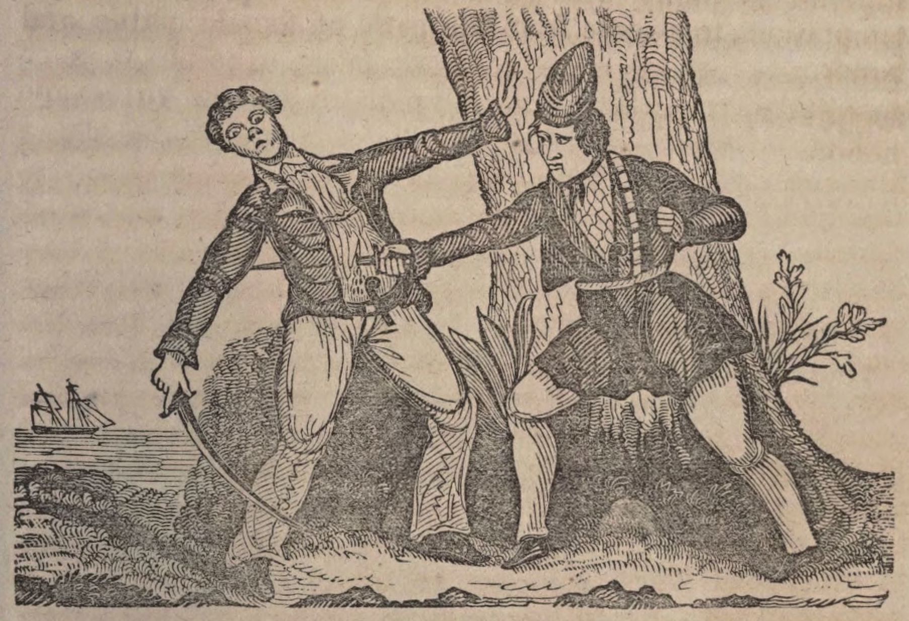
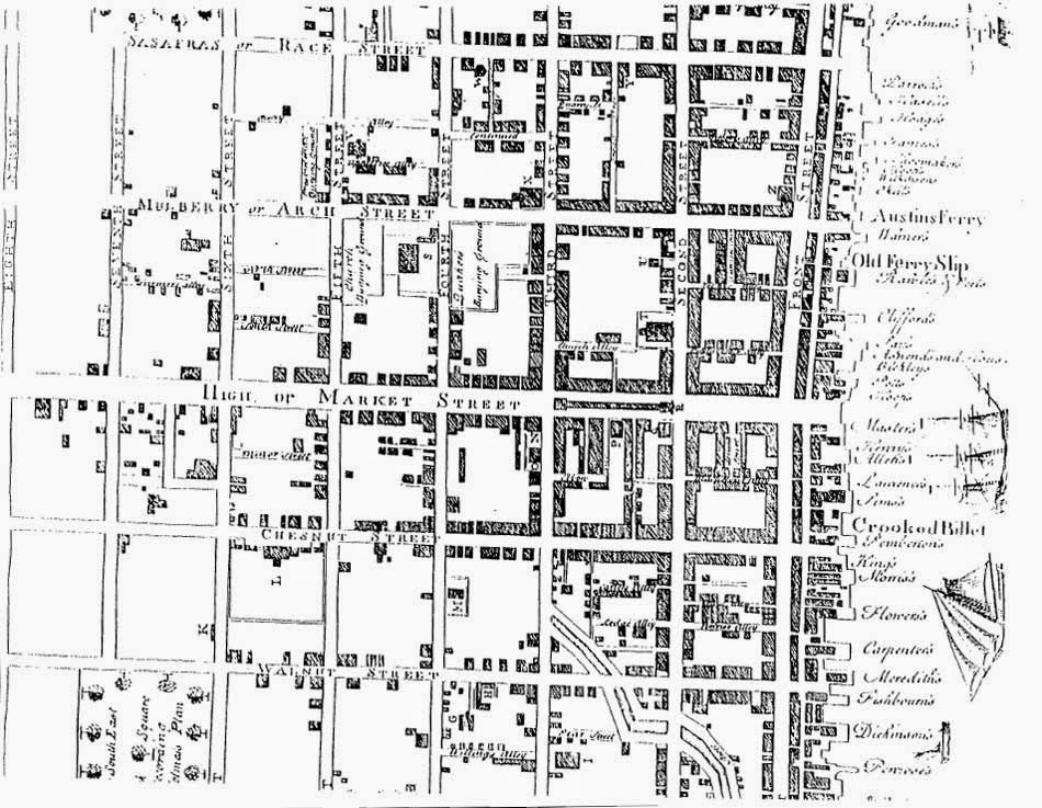
Readers might be most familiar with regional disease maps of yellow fever in Philadelphia in 1793 or John Snow’s “Ghost Map” of the 1856 that traced the spread of cholera in a London neighborhood to a specific water pump. But the cholera maps of 1832 are the first to trace the global spread of disease. These maps were included in the front covers of three book-length studies on cholera produced during the pandemic: Henri Scoutteten’s Medical and Topographical History, the Massachusetts Medical Society’s (MMS) Report on Spasmodic Cholera, and Amariah Brigham’s Treatise on Asiatic Cholera (figs. 3-4). The titles of these volumes identify the works as “reports,” “treatises,” “medical and topographical histories,” promising sobering facts about the disease. Nonetheless, these written texts reflect a cultural interpretation of the disease as a “demon malady,” something menacing, supernatural, even apocryphal.

Throughout the world from 1831-1832, cholera travelled from one territory to another rapidly, defying quarantine efforts. Its movement within a body was equally swift and terrifying, reportedly killing someone in the evening who had been well in the morning. A before and after drawing of a young Venetian woman struck with cholera illustrated the effects of dehydration that gave her a cadaverous aspect, gaunt features and a bluish coloration, typical of the disease. Her clothing changed from a dress to a chemise or nightgown, but her hairstyle, albeit mussed, was the same, indicating that this transformation occurred on the same day (fig. 5).
Cholera’s dramatic impact, the lack of experience with or understanding of the disease, and the ever-growing panic inspired doctors to study the disease and publish reports for medical and popular audiences. For example, the Boston Medical and Surgical Journal published the following statement:
It will not be the fault of the present race of physicians if posterity should obtain an inadequate idea of the history of the existing epidemic … The medical pen has been, for the last two years, teeming with productions on this subject; and we still go on, with unabated vigor and industry, adding to the number … At present, the mania for publication seems distinctly transmitted to this country, and we already rival our transatlantic friends in fertility on this topic.

As we can see, even medical language was “infected” with cholera mania, and many ostensibly objective resources like medical treatises and maps reflected and contributed to the growing fears associated with cholera.
Cholera maps have been examined by scholars as examples of nineteenth-century maps or disease history maps (i.e., Susan Schulten and Tom Koch), but they have not been studied as companions to the treatises they accompanied wherein fears about the disease were manifested in print. Using the texts as guides to read the maps can show how the fears conveyed in the text became visual and spatial on what we might expect to be an objective tool and unmediated artifact of the pandemic.
The visual impact of the maps and the production of that impact was designed to reflect the terror associated with the disease. The fact that readers of the maps had to physically unfold them also invokes the readers’ bodies and connects them with trails of sickness in the red lines (figs. 6-8). The maps opened to reveal a linear or webbed pattern of disease circulation (I don’t use the word “contagion” here because whether the disease was contagious or not was in dispute, and none of the maps used the word). In each, a printed dotted line marked the spreading disease. This line was then covered by hand with a red line. The color of blood, danger, and alarm, the red lines were not a neutral feature. They attest to the fear of the disease along the trail of sick bodies that cholera left in its wake (figs. 9 and 10).

Doctors agreed that fear was one of the predisposing conditions of cholera. In other words, one could catch cholera if one was afraid of it. Doctors believed that fear could provoke a physical reaction in a body (sometimes called “embarrassment to the heart”) that would weaken the system, making one more vulnerable to the disease. What’s worse, the physical manifestations of fear resembled the initial symptoms of cholera (fever, cramping, irregular pulse, and diarrhea), making it difficult to discern whether someone was infected with the cholera bacteria or terror. Dr. Amariah Brigham, in his text that included a map, wrote, “Almost every person who has written upon the causes that produce the cholera, mentions the fear of the disease, as among the most frequent and powerful.”
When we look at the different examples of cholera maps that were folded into book-length treatises on the disease, we have to consider the information they offer, but also their embodied affect—their role in furthering fears about the dreaded disease and, therefore, endangering the bodies of readers.
What No Eye Could Ever See
The symbols marking or lines tracing a disease on a disease map may suggest a more uniform or totalizing outbreak than people living in diseased regions experience, which shows that the primary objective is to convey a dramatic representation of its spread. To scare. As a tool, disease maps lack nuance; there is often no indication of the degree of impact, the race, class or gender of the sick, or anomalous cases. As Tom Koch argues, a disease map does not reflect the number of people who got sick, who recovered, what their circumstances were. What they do reflect is simply that people were diagnosed in a given location.

When we read the cholera maps in treatises by Scoutteten, the MMS, and Brigham, we see the movement of disease indicated in red lines, but as Koch says, we have to consider how we’re seeing disease and how the map-makers saw disease and its symptoms; in the case of cholera, that had everything to do with fear. The curve of the red lines through a region indicated the occurrence of cholera and/or cholera-like symptoms: fever, stomach pains, pulse fluctuations, and diarrhea. The distinction between actual cholera symptoms and fear-of-cholera symptoms was illegible. Brigham wrote: “Facts innumerable might be adduced to show that fear does produce the same symptoms that are now called premonitory symptoms of cholera.”
Therefore, in tracing symptoms consistent with both cholera and the fear of cholera, the red marks roping around the world in the cholera maps showed both bodies that were infected with cholera and bodies that were infected with fear. And given the attention to fear as a companion to cholera in the popular and medical press, doctors and nonmedical viewers would recognize the fear in those red lines and were likely to respond with fear themselves, perhaps even experiencing those cholera-like symptoms.

The authors of the texts that included these maps likewise drew terror on the pages of their treatises. Dr. Scoutteten offered the following as an opening to his Medical and Topographical History: “Amid the afflicting events which pour upon and threaten us, a plague formidable from its ravages, and progress, has attacked the north of Europe. Both princes and people are terrified, and the instinct of self-preservation, which governs all other interests, has diverted our attention from political debates, and fixed it upon the prospects of our material existence.” The Report on Spasmodic Cholera from the Massachusetts Medical Society claimed that “The disease is evidently one which does not lurk in the constitution. Its cause, like the venom of a viper, or a narcotic poison, produced immediate effects.” And Dr. Brigham wrote, “this country, which has until the present year escaped the ravages of a general pestilence, is at present overshadowed by the angel of death.” Overwhelming terror, viper venom, and the angel of death—these characterizations show an investment in documenting but also in recreating affect in words as the maps did in images.

Because these authors were not alone in their hyperbolic, terror-inducing characterization of cholera, medical and nonmedical readers of the maps and their red lines would have brought to their map-reading previous encounters with countless references to cholera as a body-ravaging entity, even a supernatural beast. Even in medical texts, cholera was referred to as an “avenging angel,” a “destroyer,” “death’s wing,” “foul demon’s breath,” “the demon from the East,” “the Eastern Sphinx.”
As a supernatural beast, the disease could outmaneuver even the most skilled and knowledgeable doctors, making it virtually unbeatable. As one article in the Cholera Gazette, a medical journal, noted: “The history of cholera in this city [Boston] seems to be destined to add to the number of wonders in regard to this strange malady, and to increase the difficulty of coming to any conclusion as to the laws of its appearance and progress. It is, in very truth, a most strange phenomenon—an invisible comet—a potent, relentless, and capricious enemy, striking blows in the dark, and mocking at our efforts to evade its force, or deprecate its fury.” Another doctor-author imagined a scene where “the destroying angel stood in the midst of us, with his arrow fixed and bow drawn, ready to let fly the deadly weapon, whilst half mankind lay crouching in terror at his feet.” Readers would have recognized the flight of that deadly weapon in the path marked in red on the cholera maps, unimpeded by medical intervention.

Scoutteten’s text referenced the red lines on the accompanying map in the treatise itself; this reference showed intention behind this particular detail and its relationship to the hyperbolic, sensational prose that infused the writing on cholera (the map also had printed words referring to the red lines [fig. 11]). Scoutteten wrote:
[W]e are not disposed to imitate those who close their eyes to avoid the danger: no! we yield only to conviction, and we express ourselves confidently, for it is to fulfill a duty and to oppose the progress of fear … In order to trace the Cholera, and to form an idea of it collectively, we have constructed a chart of the places where it has occurred. Its course and different directions are marked by a red line.
A few pages later, he wrote: “The vast extent of territory over which it has passed, and its rapid and fatal progress have terrified every one; we now tremblingly trace its course on the map, as we would that of a devastating army.”

Scoutteten’s use of the words “tremblingly trace” clearly reflected fear and its physical manifestation: a hand made unstable and wobbly by the path of danger it plotted in red ink on the black and white map—the effort of which could be read in the imperfections of a hand-drawn line with what was probably fountain pen ink (fig. 12). By invoking the physical effort of the person tracing the line, albeit strained by fear, Scoutteten’s text also underscored the value of using a hand-drawn line that could show affect as opposed to a printed line. In fact, the printed maps did include a thin black dashed line that provided a guide for the manually added red line. Because this was neither a solid nor bold black line, the red mark traced over it easily covered it. And without a solid printed line, the person drawing the red line might draw a less precise and all the more human, all the more trembling, red line.
Tremblingly Traced
The three cholera maps discussed here were produced at different stages of the pandemic and, therefore, document different extents of cholera’s progression as the red lines extended into additional regions on each—the fear growing as the lines reached across Europe and eventually the Atlantic.

Even though the disease existed before 1832, it did not appear on any world maps because it did not have a consistent reach beyond India and was not a cause for alarm among Westerners. A map bearing red marks indicating cholera infections would have been saturated with red, as if stabbed, around India, with some possible spatter-like red spots in Europe. Until 1817, the primary sufferers of this bacterial infection were East Indians who lived near or travelled through the Ganges River delta (it was a common result among Hindu pilgrims who travelled to the river). But due to British military and commercial routes in India, the disease travelled westward, and doctors began to take notice of it. From 1817 until 1822, it circulated irregularly in Europe. As Scoutteten wrote, “During the winter from 1830 to 1831, the cholera rested.” It may have been resting—a creature recuperating strength, but it woke up in 1831 and reached a pandemic level in 1832.
As cholera’s spread gained momentum and reach, theories arose to explain why and how it moved. For Americans who read about the progress of cholera in Europe for months before it reached the United States, these theories offered comfort. Assuming it traveled in the air, some argued that cholera wouldn’t be able to cross the Atlantic from Europe to North America, and other claims listed predisposing conditions that Americans believed were not present in the U.S., although prominent in Europe. For instance, a committee from the Massachusetts Medical Society who wrote Report on Spasmodic Cholera, which included a map, claimed the “chance that the spasmodic cholera will extend to us may be small” because American dwellings and diets were imagined to be more salubrious.

All of the three cholera maps discussed here were printed in the United States, but only the map in Brigham’s text showed North America; the absence and eventual insertion of North America on the maps reflect the hope and eventual loss of hope that the continent—the U.S. in particular—would be spared. The Scoutteten and MMS map represented a quasi-global view prominently featuring Africa, unmarred by red lines across its interior (figs. 4 and 13). Neither North nor South America is represented on this map. It features an overprint map of the British Isles, where it had reached by the time the volumes were printed. Only one, Amariah Brigham’s, showed cholera’s arrival in North America with what looks like an overprint divided by a thick line (fig. 3). So between these maps and in those red lines, we see the unraveling hope of American exceptionalism in the face of cholera.
Foul Demon’s Breath
The cholera maps, their accompanying texts, and other medical and popular writing about the disease were ostensibly created to help stop the spreading fear and warn readers against allowing themselves to become afraid. As a predisposing condition to cholera, fear could bring on the disease itself. Nonetheless, the use of hyperbolic, mythical or superstitious imagery and language employed to discuss cholera in the medical publications promoted fear by constantly reminding the readers of texts and maps that those red lines could be trembling toward them. In other words, given the understandings of the interconnectedness of cholera and fear at this time, readers ran the risk of getting ill because of these maps and their companion texts.

Running through the red striations on the cholera maps of 1832 are reports of symptoms, transformed bodies, failed interventions, hyperbolic, sensational characterizations, lost hopes of escape, fear, and its physical effects that twinned cholera’s.
As tools tracing a pandemic, these maps are artifacts of both warning and threat. For readers who believed that fear could both cause and mimic cholera itself, the anxiety these maps raised could prove deadly. Therefore, the red line—a human detail that stood out sharply against the black and white of mechanized print—warned readers (as red does) but only after they had already been caught in the winding tendrils that traced the disease.
Further Reading
Charles Rosenberg was the first to rediscover the cultural and social impact of cholera in the nineteenth century. His timeless work, The Cholera Years: The United States in 1832, 1849, and 1866 (Chicago, 1987), addresses the municipal response (or lack thereof) to the disease in New York City during three peak epidemics. Rosenberg also edited a modern reproduction of the Cholera Bulletin, a periodical composed by doctors for the general public with information about the disease and stories (often sensational) about doctors’ encounters with it. A more recent historiography of cholera and its defiance of medicine can be found in Owen Whooley, Knowledge in the Time of Cholera: The Struggle Over American Medicine in the Nineteenth Century (Chicago, 2013).
To learn more about disease maps, see Tom Koch, Disease Maps: Epidemics on the Ground (Chicago, 2011), or Susan Schulten, Mapping the Nation: History and Cartography in Nineteenth-Century America (Chicago, 2012), especially chapter 3. Other excellent resources on maps and their cultural significance include Martin Bruckner, The Geographic Revolution in Early America: Maps, Literacy, and National Identity (Chapel Hill, N.C., 2006), and Christian Jacob, The Sovereign Map: Theoretical Approaches in Cartography Throughout History (Chicago, 2006).
For more a contemporary overview of cholera’s physiological effects and the process of infection, see Ethne Barnes, Diseases and Human Evolution (Albuquerque, N.M., 2005), especially 282-283.
This article originally appeared in issue 17.1 (Fall, 2016).
Sarah Schuetze is an assistant professor of English and Humanistic Studies at the University of Wisconsin-Green Bay. Her current book project on narratives about disease in early America (including cholera) is tentatively called Calamity Howl.


